
출입구 벽면 사인 디자인 제작 설치 사례 - 여성기업종합지원센터 경북센터
날짜: 2024
작업: 공간디자인
의뢰: 여성기업종합지원센터 경북센터
디렉터: 권보배
디자인: 권보배, 박종덕
Date: 2024
Type: Space design, VMD
Client: Women Enterprise Supporting Center
Director: BOBAE KWON
Design: BOBAE KWON, JONGDEOK PARK
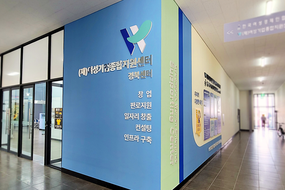
여성기업종합지원센터 경북센터 출입구 인근 벽면은 기존에 단순한 흰 벽으로 구성되어 있어 방문객이 센터 위치를 직관적으로 인지하기 어려운 구조였습니다. 본 프로젝트는 출입구 가시성을 개선하고 기관 정체성을 명확하게 전달하기 위해 벽면 전체를 활용한 환경그래픽 사인 디자인으로 기획되었습니다.
벽면은 센터 로고와 기관명을 중심으로 구성하여 멀리서도 명확히 식별되도록 설계했으며, 창업·판로지원·일자리 창출·컨설팅·인프라 구축 등 센터의 주요 기능을 시각적으로 정리해 방문자가 한눈에 이해할 수 있도록 정보 위계를 구성했습니다. 컬러는 공공기관 이미지에 적합한 안정감 있는 블루 톤을 기반으로 하여 신뢰성과 전문성을 강화했습니다.
단순 장식이 아닌 안내 기능을 강화하는 사인 시스템으로서 출입 동선을 유도하고, 기관 브랜딩과 공간 인지성을 동시에 개선한 공공기관 환경그래픽 디자인 사례입니다.
The entrance wall of the Gyeongbuk Center of the Women Enterprise Comprehensive Support Center was originally a plain white surface, making it difficult for visitors to easily identify the location of the facility. This project transformed the wall into a large-scale environmental graphic signage system designed to improve visibility and strengthen institutional branding.
The wall design prominently features the center’s logo and name to ensure clear recognition from a distance. Key services such as startup support, sales assistance, job creation, consulting, and infrastructure development are visually organized to communicate the institution’s role at a glance. A stable blue color palette was selected to reinforce trust, professionalism, and public-sector identity.
Rather than serving as decorative graphics, the installation functions as a wayfinding and branding solution, enhancing entrance visibility and spatial recognition within a public institutional environment.