
투비라인뷰티(2B Line Beauty) 브랜드 아이덴티티 디자인 사례
날짜: 2020. 02.
작업: 아이덴티티 디자인, 브랜딩
의뢰: 투비라인뷰티
디렉터: 권보배
디자인: 권보배
Date: 2020. 02.
Type: Brand Identity Design
Client: 2B Line Beauty
Director: BOBAE KWON
Design: BOBAE KWON
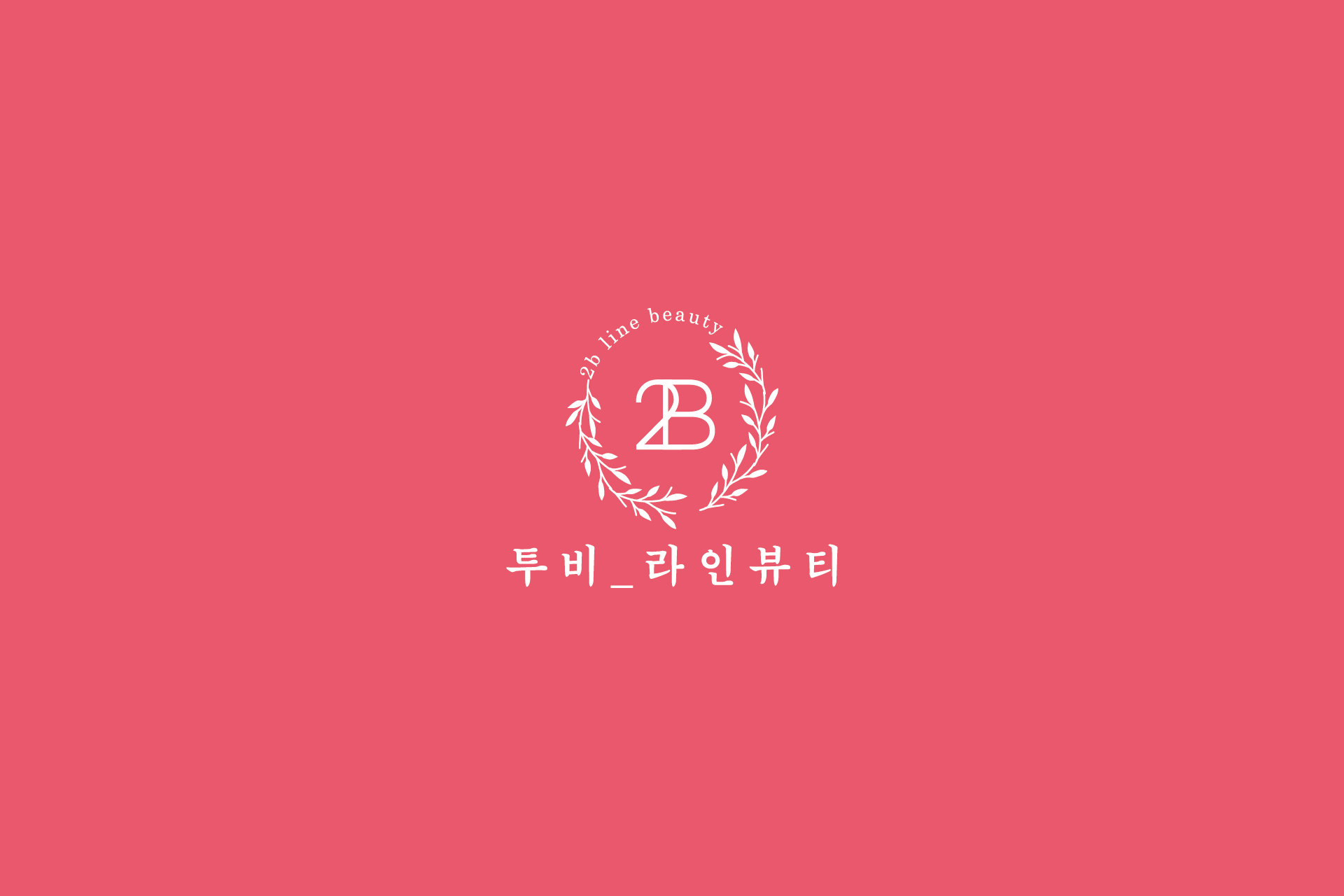
투비라인뷰티 아이덴티티는 프리미엄 뷰티 브랜드의 이미지를 구축하기 위해 설계된 로고 디자인 프로젝트입니다. 중앙의 ‘2B’ 이니셜을 중심으로 월계수 리스 형태를 구성하여 전문성과 신뢰감을 상징적으로 표현했습니다.
부드러운 곡선의 타이포그래피와 핑크 컬러 팔레트는 뷰티 산업 특유의 섬세함과 감성적 이미지를 강조하며, 브랜드의 여성스러움과 고급스러움을 동시에 전달합니다. 심플한 구조 안에서 균형 잡힌 레이아웃을 유지하여 간판, 명함, 패키지, SNS 홍보 이미지, 이벤트 행사 배너 등 다양한 마케팅 매체로 자연스럽게 확장 가능한 브랜딩 시스템으로 개발되었습니다.
살롱 운영, 신제품 홍보, 프로모션 행사 등 브랜드의 성장 단계에 맞춰 활용할 수 있도록 설계된 아이덴티티 디자인 사례입니다.
The 2B Line Beauty brand identity was developed to establish a premium and refined image within the beauty industry. The central “2B” monogram is framed by a laurel wreath, symbolizing professionalism, trust, and brand prestige.
Soft curved typography and a pink color palette emphasize elegance and emotional appeal, reflecting the delicate yet confident nature of the beauty brand. The balanced composition allows seamless application across signage, business cards, packaging, social media promotions, and event marketing materials.
This identity system was designed to support salon operations, promotional campaigns, product launches, and long-term brand growth through consistent visual communication.