
구미 수족관 로고 디자인 - 백경 수족관 브랜딩 사례
날짜: 2022.12.
작업: 아이덴티티 디자인
의뢰: 백경수족관
디렉터: 권보배
디자인: 권보배
Date: 2022.12.
Type: Identity design
Client: Baekgyeong Aquarium
Director: BOBAE KWON
Design: BOBAE KWON
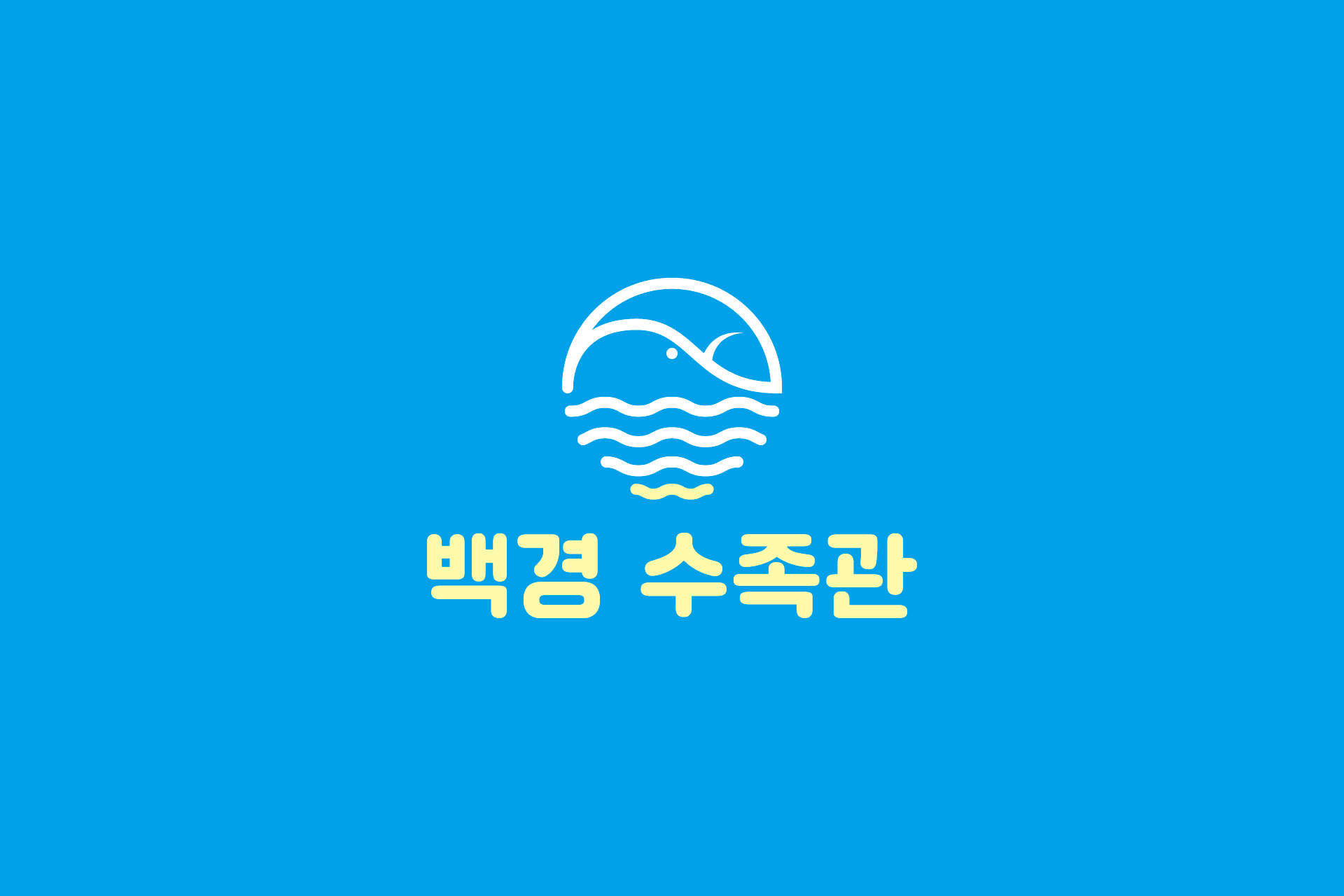
백경 수족관 브랜딩은 물과 생명의 이미지를 직관적으로 전달하는 심볼형 아이덴티티 디자인 프로젝트입니다. 브랜드명에서 연상되는 ‘넓은 바다’의 이미지를 바탕으로, 수면과 물결을 단순화한 그래픽 모티프를 중심으로 로고를 개발했습니다.
심볼은 원형 구조 안에 물고기와 파도의 흐름을 간결한 라인으로 구성하여, 친근하면서도 기억에 남는 형태로 설계되었습니다. 블루 계열 컬러를 중심으로 한 색상 체계는 수족관 업종의 청결함과 신뢰감을 강조하며, 매장 간판과 인쇄물 등 다양한 매체에 적용할 수 있도록 높은 활용성을 고려했습니다.
간결한 조형과 안정적인 컬러 대비를 통해 오프라인 매장에서의 가시성을 높이고, 브랜드가 전달하고자 하는 편안하고 신뢰감 있는 이미지를 시각적으로 완성한 브랜딩 사례입니다.
The Baekgyeong Aquarium branding project focuses on creating a clean and memorable identity inspired by water and marine life.
The logo is built around a simplified circular symbol combining waves and a fish silhouette, visually representing the vast and calm image suggested by the brand name. The minimal line-based design ensures strong recognizability while maintaining a friendly and approachable tone.
A blue-centered color system reinforces clarity, freshness, and trust—key attributes for an aquarium and pet-related retail space. The identity is designed for flexible use across signage, print materials, and store applications, ensuring consistent visibility in real retail environments.
This project highlights how simple visual language can effectively communicate reliability and warmth within a specialized retail brand.