
경북 디자인 지원사업 브랜드 디자인 사례 – 난달 아이덴티티 디자인
날짜: 2023.05.
작업: 아이덴티티 디자인
의뢰: 난달
디렉터: 권보배
디자인: 권보배, 박종덕
Date: 2023.05.
Type: Identity design
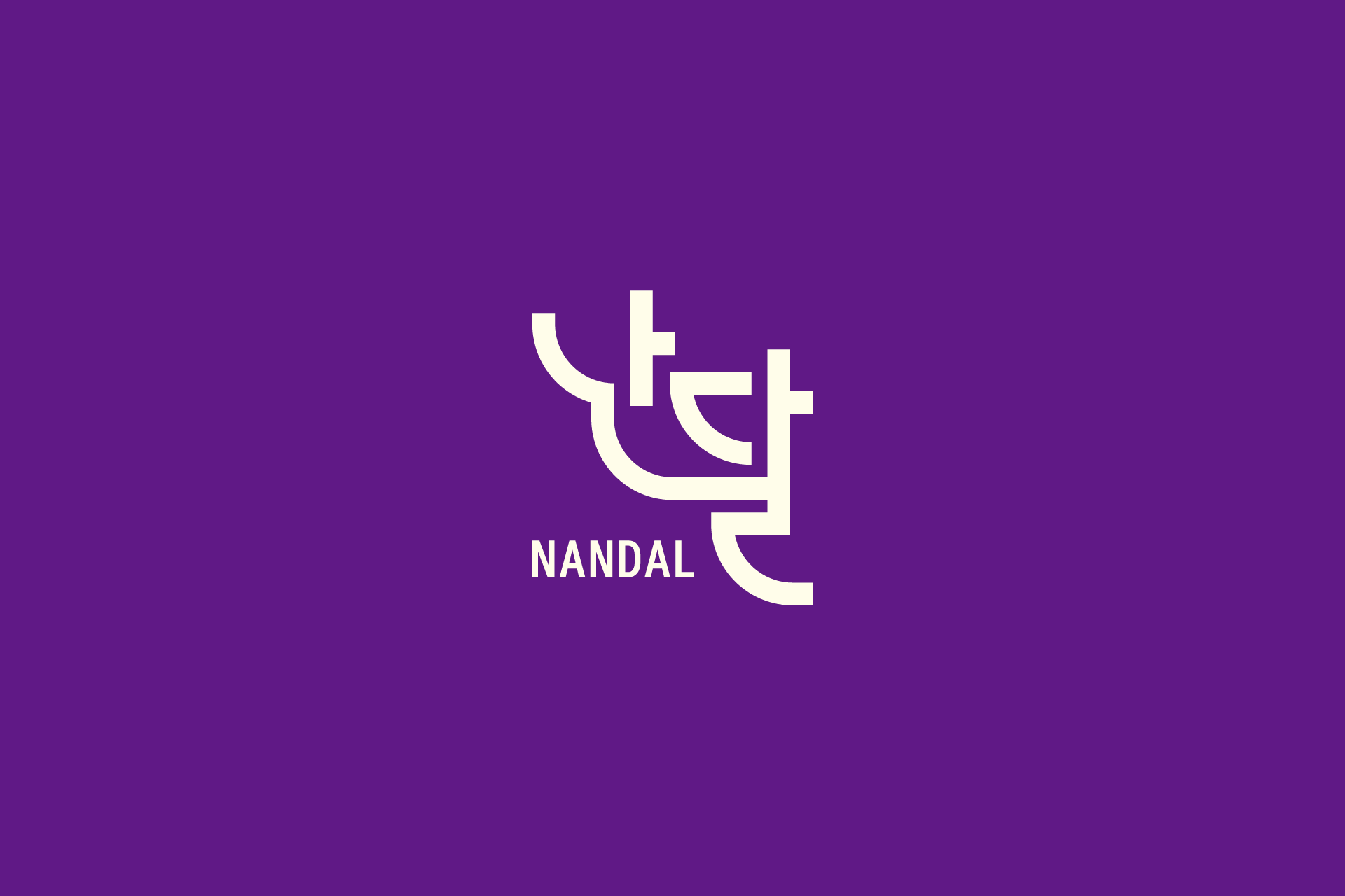
Client: NANDAL
Director: BOBAE KWON
Design: BOBAE KWON, JONGDEOK PARK
2023년 경상북도 디자인산업 육성프로젝트 ‘디자인 애로사항 해결지원’ 사업의 수행기업으로 참여하여 전문 유통기업 난달(NANDAL)의 브랜드 아이덴티티 디자인을 진행했습니다. 본 사업은 대구경북디자인진흥원이 주관한 기업 지원 프로젝트로, 브랜드 경쟁력 강화를 위한 디자인 고도화를 목표로 수행되었습니다.
난달은 유통 기반 전문 기업으로, 명확한 브랜드 인지도 형성과 확장 가능한 시각 아이덴티티 구축이 필요한 상황이었습니다. 이에 따라 직관적인 조형 언어를 기반으로 한 심볼 중심의 로고 시스템을 개발하고, 다양한 매체 환경에서 일관된 브랜드 경험을 전달할 수 있도록 아이덴티티 방향을 설계했습니다.
심볼은 한글 구조의 조형적 리듬을 현대적으로 재해석한 형태로 개발되었으며, 간결한 선과 안정적인 비례를 통해 기업의 신뢰성과 전문성을 시각적으로 표현했습니다. 보라색 기반의 컬러 전략은 브랜드 차별성을 확보하는 동시에 디지털, 인쇄, 사인물 등 다양한 적용 환경을 고려해 설계되었습니다.
본 프로젝트는 공공 디자인 지원사업을 통해 수행된 기업 브랜딩 사례로, 브랜드 전략 방향 수립부터 로고 디자인 및 아이덴티티 구축까지 전 과정을 수행기업으로 참여해 진행했습니다.
In 2023, BULKKOT participated as an official design partner in the Gyeongsangbuk-do Design Industry Promotion Project, organized by the Daegu-Gyeongbuk Design Promotion Agency. Through this initiative, we developed the brand identity for NANDAL, a professional distribution company.
The project aimed to strengthen the company’s brand recognition through a refined and scalable visual identity system. We focused on creating a symbol-driven logo that could maintain consistency across various brand touchpoints, including digital media, print applications, and spatial branding.
The identity symbol reinterprets the structural rhythm of Korean typography into a modern visual language. Clean lines and balanced proportions were applied to convey reliability and professionalism, while the purple color strategy was designed to enhance brand distinctiveness and versatility across applications.
This project represents a public-sector supported branding case where BULKKOT led the entire process, from brand strategy development to logo and identity system design.