
카페 글린트 아이덴티티 디자인
날짜: 2021. 10.
작업: 아이덴티티 디자인, 브랜딩
의뢰: 카페글린트
디렉터: 권보배
디자인: 권보배
Date: 2021. 10.
Type: Brand Identity Design
Client: Cafe Glint
Director: BOBAE KWON
Design: BOBAE KWON
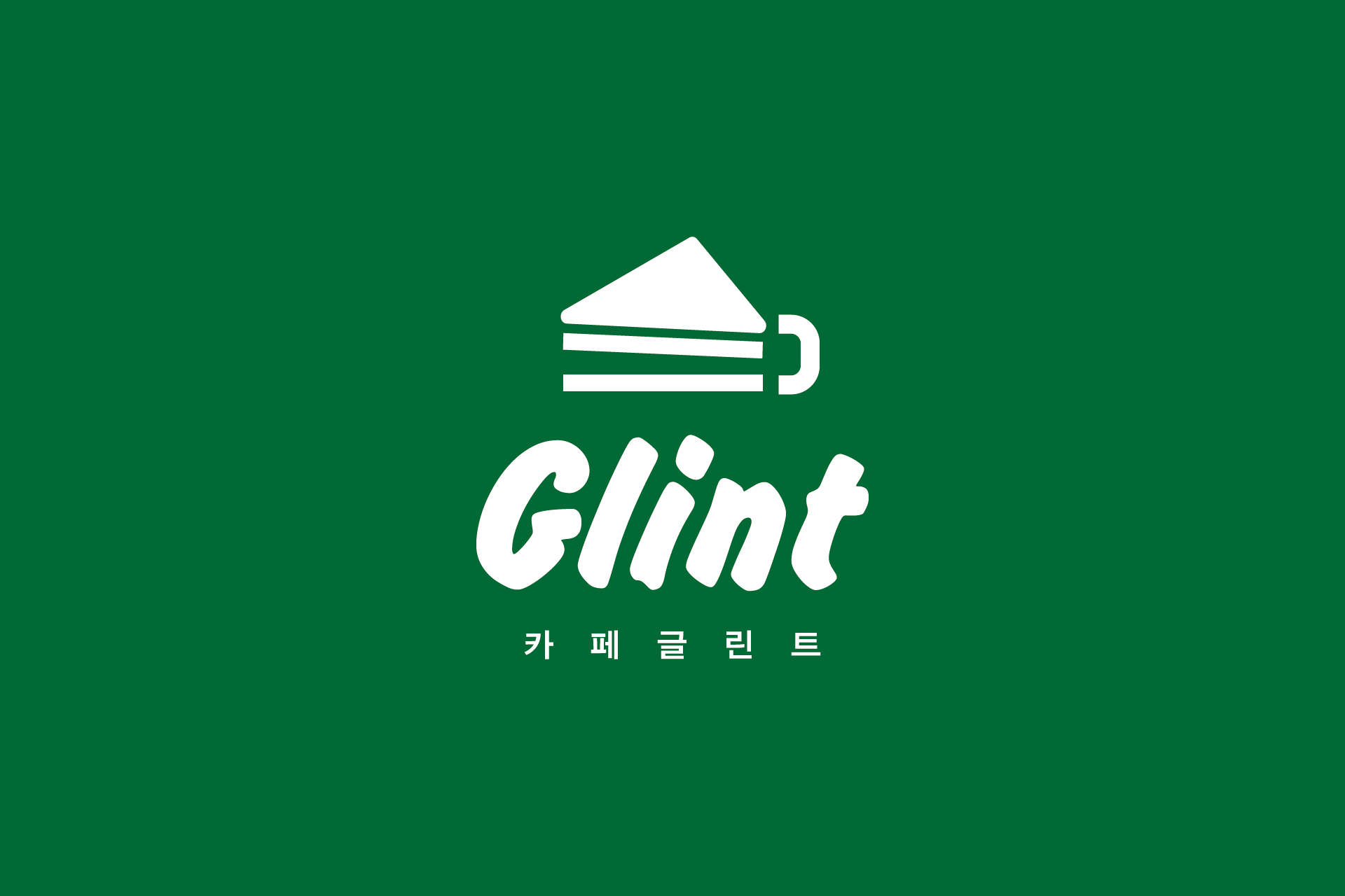
카페 글린트는 디저트 카페 특유의 달콤하고 편안한 분위기를 시각적으로 풀어낸 브랜드 아이덴티티 디자인입니다. 케이크를 단순화한 심볼은 메뉴의 핵심 이미지를 직관적으로 전달하면서도, 누구나 쉽게 기억할 수 있는 명확한 브랜드 인상을 형성합니다.
부드러운 곡선의 로고타입과 간결한 심볼 구조는 카페 공간 전반에 자연스럽게 어우러지도록 설계되었으며, 간판, 메뉴판, 패키지, SNS 등 다양한 접점에서 일관된 브랜드 경험을 제공합니다. 그린 컬러를 중심으로 한 컬러 시스템은 신선함과 안정감을 동시에 전달하며, 카페 공간의 분위기를 더욱 또렷하게 만들어줍니다.
소규모 카페 창업이나 디저트 브랜드를 준비하는 분들에게 참고가 될 수 있는 아이덴티티 사례로, 공간 브랜딩과 시각 아이덴티티를 함께 고려한 카페 브랜딩 프로젝트입니다.
Cafe Glint is a brand identity design that visually captures the sweet and relaxed atmosphere of a dessert café. The simplified cake symbol communicates the core menu concept clearly while creating a memorable and approachable brand impression.
The soft, rounded logotype and minimal symbol structure are designed to blend naturally across various touchpoints, including signage, menus, packaging, and social media. The green-centered color system conveys both freshness and calmness, helping define the overall mood of the café space.
This project serves as a strong branding reference for small café startups and dessert brands, showcasing how spatial branding and visual identity can work together to build a cohesive café experience.