
취회떠 횟집 브랜드 아이덴티티 디자인 사례
날짜: 2020. 10.
작업: 아이덴티티 디자인, 브랜딩
의뢰: 취회떠
디렉터: 권보배
디자인: 권보배
Date: 2020. 10.
Type: Brand Identity Design
Client: Chwihoeddeo
Director: BOBAE KWON
Design: BOBAE KWON
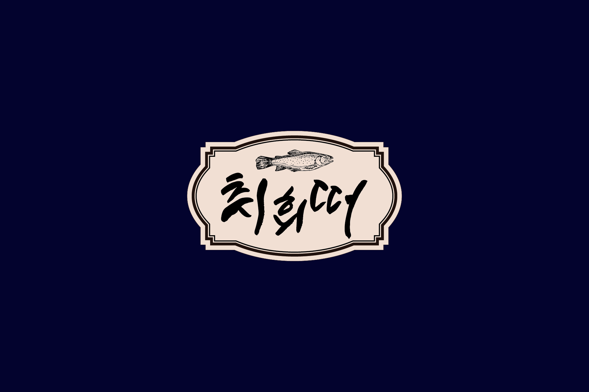
취회떠는 ‘취했어’의 혀짧은 발음을 위트 있게 차용한 네이밍이자, 동시에 ‘회를 뜬다’는 표현을 중의적으로 담은 횟집 아이덴티티 디자인 프로젝트입니다. 발음에서 오는 친근함과 회 전문점의 직관적 메시지를 하나의 단어 안에 결합해, 기억에 남는 브랜드 언어를 완성했습니다.
로고 타이포그래피는 글자의 균형을 의도적으로 살짝 흐트러지게 구성해 마치 취기가 오른 듯한 리듬감을 표현했습니다. 이는 단순한 장식이 아닌, 브랜드 네이밍과 연결된 콘셉트 설계의 결과입니다.
클래식한 엠블럼 프레임과 어종 일러스트는 전문성과 신뢰감을 보완하며, 네이비와 베이지 컬러 조합은 안정적인 외식 브랜드 이미지를 형성합니다. 간판, 메뉴판, 패키지, 매장 사인 등 다양한 접점에서 일관된 브랜드 경험을 구축하도록 설계된 외식업 브랜딩 사례입니다.
Chwihoeddeo is a seafood restaurant brand identity project built on playful wordplay. The name reflects a childlike pronunciation of “I’m drunk” in Korean while simultaneously referencing the act of slicing raw fish. This dual meaning creates a memorable and culturally rooted brand language.
The typography intentionally carries a slightly off-balance rhythm, visually echoing a subtle sense of intoxication. This design choice is conceptually aligned with the brand narrative rather than being decorative.
A classic emblem frame and fish illustration reinforce professionalism and credibility, while the navy and beige palette establishes a stable and trustworthy dining brand image. The identity system is designed for cohesive application across signage, menus, packaging, and spatial branding.