
달그릇공방 수공예 브랜드 아이덴티티 디자인 사례
날짜: 2019. 09.
작업: 아이덴티티 디자인, 브랜딩
의뢰: 달그릇공방
디렉터: 권보배
디자인: 권보배
Date: 2019. 09.
Type: Brand Identity Design
Client: Dalgereut Workshop
Director: BOBAE KWON
Design: BOBAE KWON
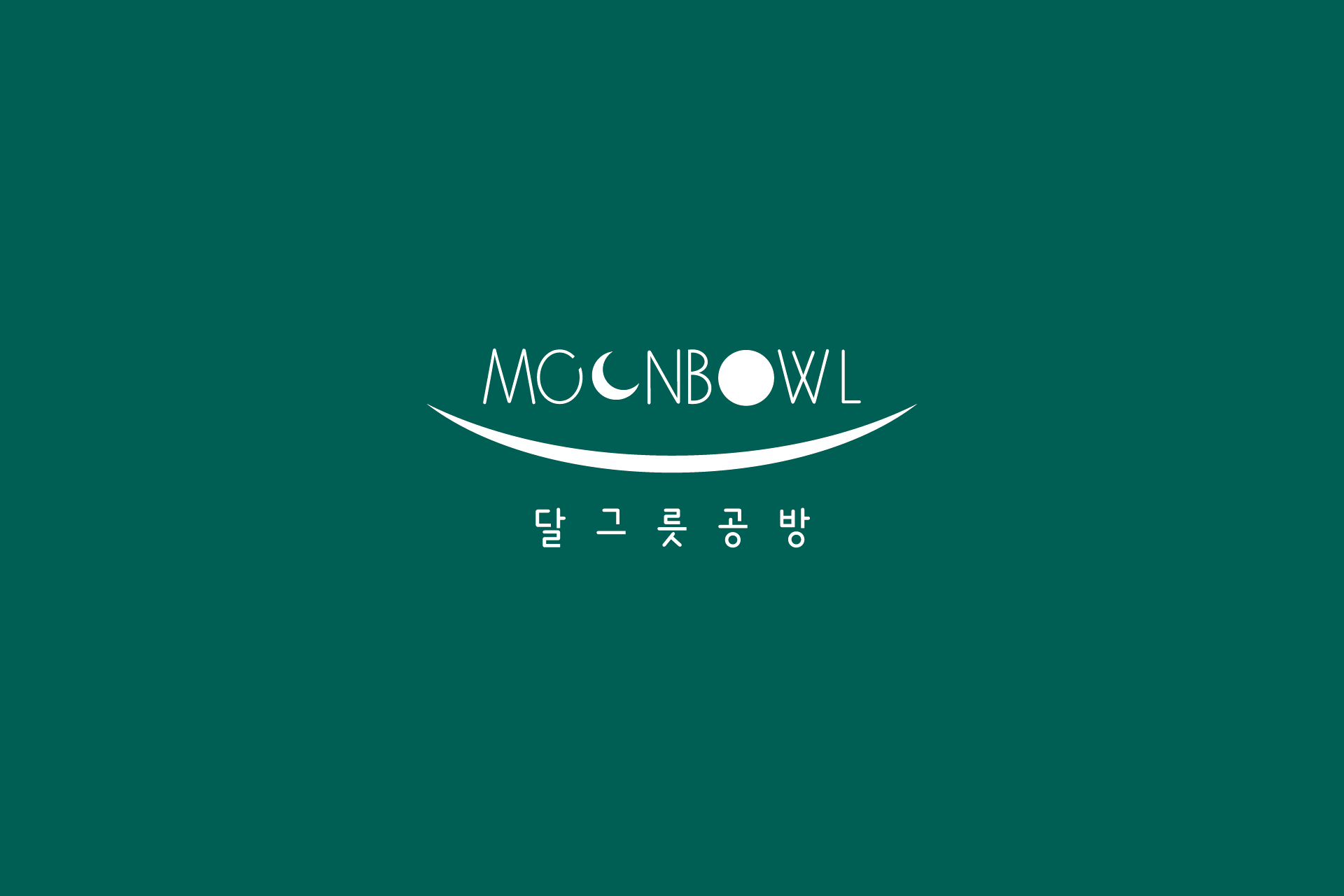
달그릇공방은 도자기 및 수공예 작업을 기반으로 한 창작 공방 브랜드로, ‘달’이라는 상징적 이미지를 중심으로 감성적이고 서정적인 아이덴티티를 설계한 프로젝트입니다. 영문 네이밍 MOONBOWL과 한글 브랜드명을 함께 구성하여 공방의 정체성과 스토리성을 동시에 전달하도록 기획했습니다.
초승달과 그릇을 연상시키는 곡선 요소는 브랜드명과 자연스럽게 연결되며, 부드러운 타이포그래피는 공방 특유의 따뜻함과 수공예의 정성을 시각적으로 표현합니다. 단순하지만 상징적인 구조로 제작되어 간판, 명함, 제품 라벨, 패키지, 클래스 홍보물 등 다양한 매체에 확장 적용이 가능합니다.
공방 브랜드는 감성만으로 유지되지 않습니다. 안정적인 가독성과 상징성을 기반으로 설계된 아이덴티티는 클래스 운영, 온라인 판매, 전시 및 홍보 활동까지 연결될 수 있는 장기적 브랜드 자산이 됩니다.
Dalgeureut Gongbang is a handcrafted ceramic studio brand built around the poetic concept of the “moon.” This identity project combines the English name MOONBOWL with the Korean brand name to communicate both emotional storytelling and clear brand positioning.
The crescent-inspired curve visually connects the concept of the moon and a bowl, while the soft typography expresses warmth and artisanal craftsmanship. The minimal yet symbolic structure allows consistent application across signage, business cards, product labels, packaging, and workshop promotions.
A craft studio brand must balance emotion with structure. This identity system was designed to support class operations, online sales, exhibitions, and promotional activities, becoming a long-term visual asset for sustainable brand growth.