
구미 샌드위치 브랜드 로고 디자인 - 에그머니나 아이덴티티
날짜: 2022.05.
작업: 아이덴티티 디자인
의뢰: 에그머니나
디렉터: 권보배
디자인: 권보배
Date: 2022.05.
Type: Identity design
Client: EGG momina
Director: BOBAE KWON
Design: BOBAE KWON
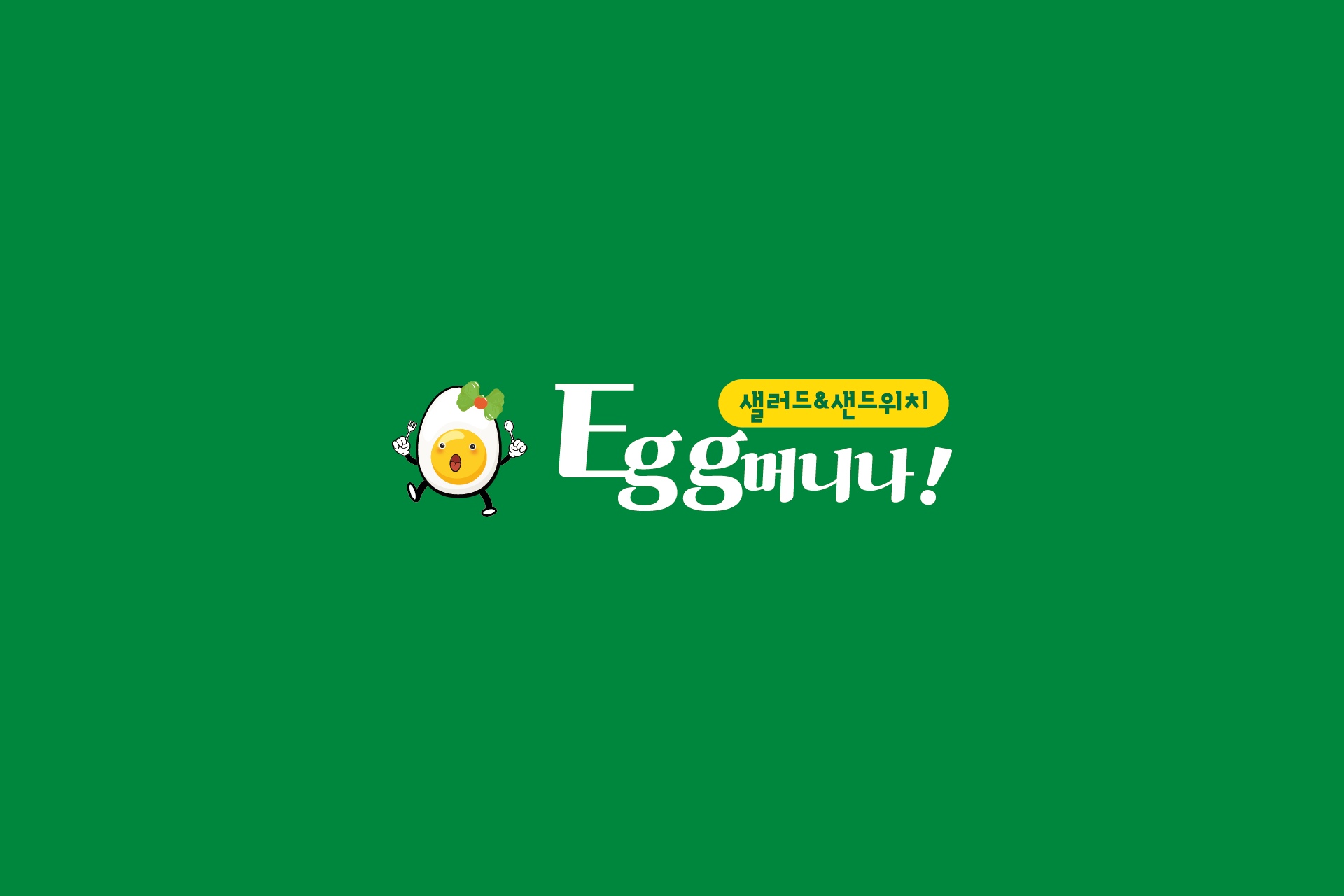
에그머니나는 샐러드와 샌드위치를 중심으로 한 F&B 브랜드 아이덴티티 디자인 프로젝트입니다. 브랜드 콘셉트에 맞춰 로고와 캐릭터를 함께 개발하여 친근한 브랜드 이미지를 구축했습니다.
로고는 브랜드명에서 느껴지는 유쾌한 어감을 살리는 방향으로 설계되었으며, 계란을 모티프로 한 캐릭터를 중심으로 시각적인 인지성을 강화했습니다. 단순한 로고 제작을 넘어, 매장 간판, 패키지, 메뉴판 등 다양한 매체에서 활용 가능한 그래픽 확장성을 고려한 브랜딩 구조로 완성되었습니다.
명확한 색상 대비와 간결한 타이포 조합을 통해 식음 브랜드 특유의 경쾌한 분위기를 유지하면서도, 실제 매장 환경에서 높은 가독성을 확보하도록 디자인했습니다. 캐릭터 기반 브랜딩을 통해 브랜드의 개성과 기억도를 동시에 강화한 사례입니다.
This project presents the brand identity design for Egg Monina, a salad and sandwich-focused F&B brand. The identity was developed with both logo and character design to create a friendly and memorable brand image.
The logo captures the playful tone of the brand name, while the egg-inspired character enhances visual recognition. Rather than a standalone mark, the identity was designed as a flexible branding system applicable across signage, packaging, menus, and in-store graphics.
The use of bold color contrast and clean typography maintains a lively food brand atmosphere while ensuring strong readability in real-world environments. This project demonstrates how character-driven branding can strengthen both uniqueness and memorability.