
금오산 카페 브랜딩 사례 – 버터랜딩 아이덴티티 디자인
날짜: 2024.08.
작업: 아이덴티티 디자인
의뢰: 은블랑
디렉터: 권보배
디자인: 권보배, 박종덕
Date: 2024.08.
Type: Identity design
Client: EUN BLANC
Director: BOBAE KWON
Design: BOBAE KWON, JONGDEOK PARK
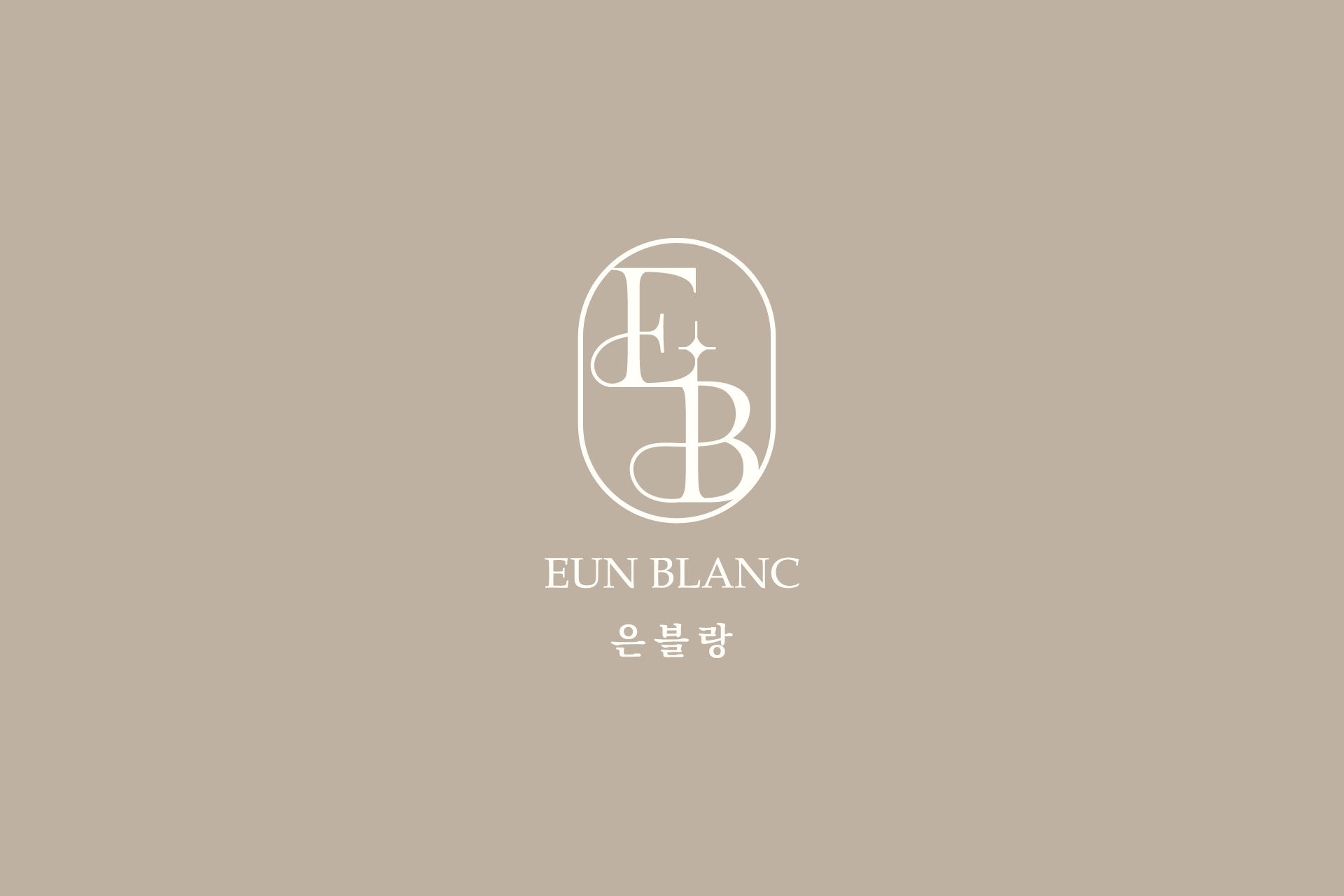
은블랑(EUN BLANC)의 브랜드 아이덴티티 디자인을 진행했습니다. 은블랑은 절제된 아름다움과 고급스러운 감성을 기반으로 한 프리미엄 라이프스타일 브랜드로, 브랜드의 분위기를 직관적으로 전달할 수 있는 심볼 중심의 아이덴티티 개발을 목표로 프로젝트가 진행되었습니다.
로고는 이니셜 ‘E’와 ‘B’를 조형적으로 결합한 모노그램 형태로 설계했으며, 곡선과 세리프 타이포그래피를 활용해 클래식하면서도 세련된 이미지를 구축했습니다. 심볼 내부의 별 형태 디테일은 브랜드의 섬세함과 프리미엄 가치를 상징적으로 표현하는 요소로 반영되었습니다.
컬러 시스템은 뉴트럴 베이지 톤을 중심으로 구성하여 차분하면서도 고급스러운 브랜드 무드를 강조했으며, 다양한 어플리케이션에서 일관된 브랜드 경험을 전달할 수 있도록 확장성을 고려해 설계되었습니다.
본 프로젝트는 프리미엄 브랜드 아이덴티티 구축을 목표로, 로고 디자인부터 전반적인 브랜드 톤앤매너까지 통합적으로 개발한 브랜딩 사례입니다.
This project involved the brand identity design for EUN BLANC, a premium lifestyle brand focused on refined aesthetics and understated elegance. The goal was to develop a symbol-driven identity that communicates the brand’s sophisticated mood at a glance.
The logo was designed as a monogram combining the initials “E” and “B,” using elegant curves and serif-inspired typography to create a timeless yet modern impression. A subtle star detail within the symbol was introduced to represent delicacy and premium value.
A neutral beige color palette was selected to reinforce the brand’s calm and luxurious tone. The identity system was developed with scalability in mind, ensuring consistent application across various brand touchpoints.
This project represents a premium brand identity case handled by BULKKOT, covering everything from logo creation to a cohesive visual tone and branding direction.