
금오산 카페 브랜딩 사례 – 버터랜딩 아이덴티티 디자인
날짜: 2023.12.
작업: 아이덴티티 디자인
의뢰: 버터랜딩
디렉터: 권보배
디자인: 권보배, 박종덕
Date: 2023.12.
Type: Identity design
Client: BUTTER LANDING
Director: BOBAE KWON
Design: BOBAE KWON, JONGDEOK PARK
금오산 인근 로컬 카페 버터랜딩(BUTTER LANDING)의 브랜드 아이덴티티 디자인을 진행했습니다. 버터랜딩은 자연과 휴식이 어우러진 금오산 상권 내 카페 브랜드로, 차별화된 브랜드 이미지 구축을 위한 아이덴티티 디자인 프로젝트로 진행되었습니다.
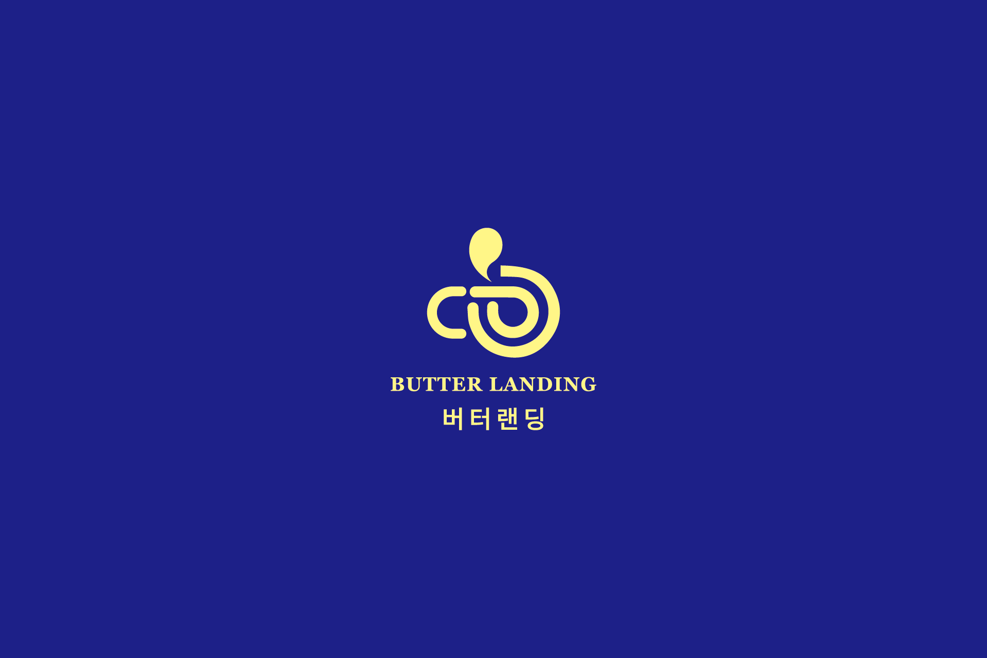
브랜드명 ‘BUTTER LANDING’이 주는 부드럽고 따뜻한 인상을 시각적으로 전달하기 위해 심볼 중심의 브랜드 구조를 설계했습니다. 심볼은 버터의 유기적인 질감과 착륙(Landing)의 개념을 결합한 조형 언어로 개발되었으며, 곡선 중심의 형태를 통해 편안하고 감각적인 브랜드 무드를 표현했습니다.
컬러 시스템은 깊이 있는 블루와 버터 옐로우의 대비를 중심으로 구성해 고급스러움과 친근함을 동시에 전달하도록 설계했습니다. 해당 컬러 전략은 간판, 패키지, 메뉴판, SNS 등 다양한 브랜드 접점에서 일관된 아이덴티티를 유지할 수 있도록 고려되었습니다.
본 프로젝트는 금오산 상권 로컬 카페 브랜딩 사례로, 브랜드 방향 설정부터 로고 디자인 및 아이덴티티 구축까지 통합적으로 진행한 디자인 프로젝트입니다.
This project involved the brand identity design for BUTTER LANDING, a local café located near Geumosan Mountain in Gumi. The branding was developed to establish a distinctive visual identity that reflects the café’s warm and relaxing atmosphere within a nature-oriented setting.
The symbol-driven identity was designed to visually express the soft and comforting impression suggested by the name “Butter Landing.” The mark combines organic, butter-like curves with the concept of landing, resulting in a smooth and inviting visual language.
A contrasting color strategy of deep blue and butter yellow was applied to balance sophistication and friendliness. The palette was designed to work consistently across various brand touchpoints, including signage, packaging, menus, and digital platforms.
This project represents a local café branding case in Gumi, where BULKKOT handled the entire process from brand direction and logo design to a cohesive identity system.