
이루다영어 영어교육 브랜드 아이덴티티 디자인 사례
날짜: 2020. 12.
작업: 아이덴티티 디자인, 브랜딩
의뢰: 이루다영어
디렉터: 권보배
디자인: 권보배
Date: 2020. 12.
Type: Brand Identity Design
Client: IRUDA English
Director: BOBAE KWON
Design: BOBAE KWON
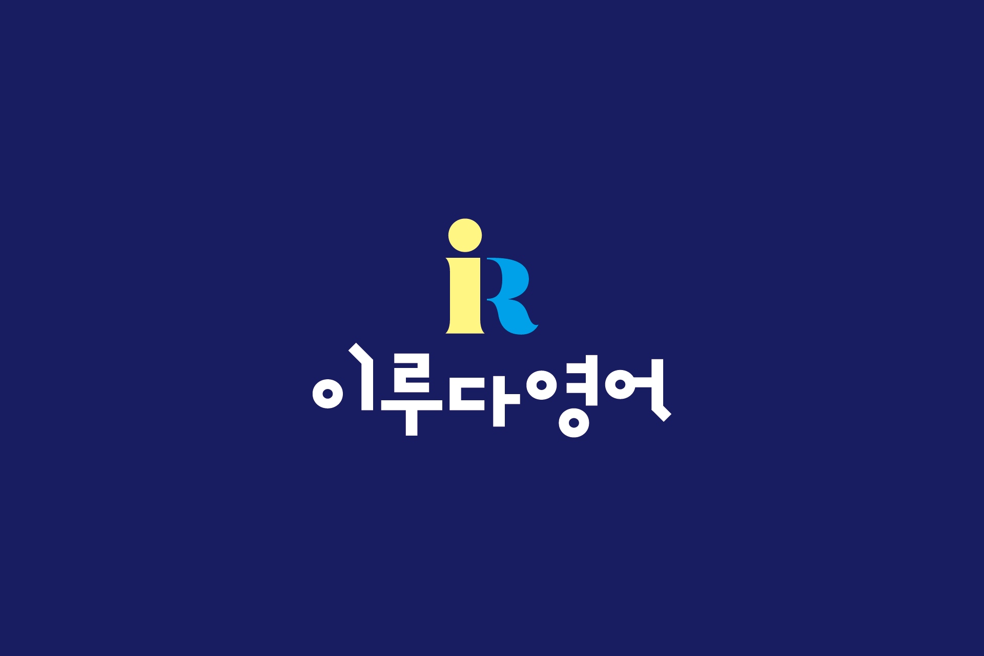
이루다영어는 교육 브랜드 특유의 신뢰감과 친근함을 동시에 전달하기 위해 설계된 영어교육 아이덴티티 디자인 프로젝트입니다. 브랜드 이니셜 ‘I’와 ‘R’을 결합한 심볼은 간결한 구조 속에서 학습의 시작과 성장의 흐름을 시각적으로 표현하도록 구성되었습니다.
심볼의 따뜻한 옐로 톤은 학습의 긍정적인 에너지를 상징하며, 블루 컬러는 안정감과 신뢰를 더해 교육 브랜드로서의 균형을 잡아줍니다. 한글 워드마크는 단정하면서도 부드러운 인상을 주도록 설계되어 학원, 교습소 등 다양한 교육 형태에 자연스럽게 적용될 수 있도록 고려했습니다.
간판, 교재, 학원 홍보물, 온라인 콘텐츠 등 다양한 매체에서 일관된 인지도를 확보할 수 있도록 확장성을 중심으로 개발된 아이덴티티입니다. 교육 브랜드 창업 또는 리뉴얼을 고민하는 영어학원·교육기관 브랜딩 사례로 활용 가능한 디자인 접근을 보여줍니다.
Iruda English is an educational brand identity project designed to balance trust and approachability—two key qualities for language education brands. The symbol combines the initials “I” and “R” into a clean, structured mark that visually represents the beginning of learning and the process of growth.
The warm yellow tone conveys positive learning energy, while the blue accent reinforces stability and credibility. The Korean wordmark was crafted to appear neat yet friendly, allowing the identity to adapt seamlessly across different educational formats, including academies and private institutes.
Developed with scalability in mind, the identity maintains consistency across signage, textbooks, promotional materials, and digital platforms. This project demonstrates a practical branding approach suitable for English academies and education startups seeking a refined and adaptable visual identity.