
꽃동네 주점 레트로 감성 브랜드 아이덴티티 디자인 사례
날짜: 2020. 10.
작업: 아이덴티티 디자인, 브랜딩
의뢰: 꽃동네주점
디렉터: 권보배
디자인: 권보배
Date: 2020. 10.
Type: Brand Identity Design
Client: Kkotdongne
Director: BOBAE KWON
Design: BOBAE KWON
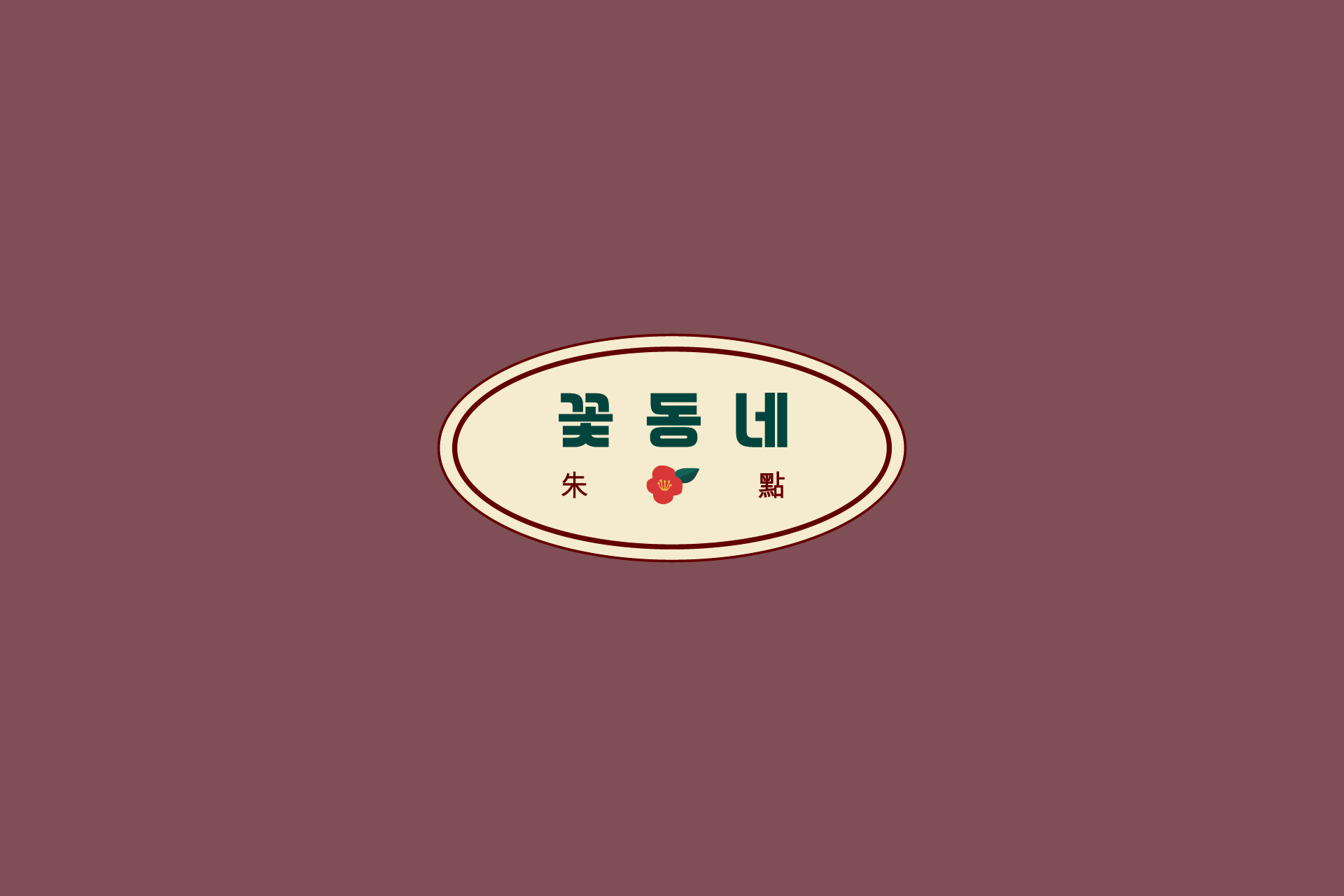
꽃동네 주점 브랜드 아이덴티티는 전통 주점의 정서를 현대적으로 재해석한 로고 디자인 프로젝트입니다. 타원형 엠블럼 구조를 중심으로 구성하여 간판 적용 시 가시성과 상징성을 동시에 확보하도록 설계했습니다.
로고에 사용된 한자 표기는 일반적인 ‘주점(酒店)’ 표기 대신, 붉을 주(朱)와 점찍을 점(點)을 활용한 조합으로 구성했습니다. 이는 술을 직설적으로 표현하기보다, 붉은 꽃과 공간의 분위기를 은유적으로 담아낸 위트 있는 시각 장치입니다. 전통적인 형식을 차용하되 그대로 답습하지 않고, 브랜드만의 해석을 더해 기억에 남는 상징으로 재구성했습니다.
한글 타이포그래피는 안정감 있는 구조로 설계하여 주점 특유의 친근함을 강조했으며, 딥 레드 컬러와 플라워 심볼을 통해 따뜻하고 정감 있는 공간 이미지를 전달합니다. 간판, 메뉴판, 패키지, 행사 홍보물 등 다양한 매체로 확장 가능한 브랜딩 시스템으로 개발된 아이덴티티 디자인 사례입니다.
The Kkotdongne Pub brand identity reinterprets the emotional atmosphere of a traditional Korean tavern through a contemporary visual language. The oval emblem structure was designed to ensure strong visibility and symbolic presence when applied to signage.
Instead of using the conventional characters for “pub” (酒店), the logo incorporates the characters for “crimson” (朱) and “mark” (點). This subtle reinterpretation avoids a literal reference to alcohol and instead conveys the brand’s mood through the imagery of red blossoms and warmth. By borrowing the structure of tradition while gently transforming it, the design introduces a layer of wit and distinctiveness to the identity.
The Korean typography was structured for balance and approachability, while the deep red palette and floral symbol reinforce warmth and spatial character. The identity system was developed for scalable applications across signage, menus, packaging, promotional materials, and event branding.