
모아이뷰티 아이덴티티 디자인
날짜: 2021. 05.
작업: 아이덴티티 디자인, 브랜딩
의뢰: 모아이뷰티
디렉터: 권보배
디자인: 권보배
Date: 2021. 05.
Type: Brand Identity Design
Client: MO.I BEAUTY
Director: BOBAE KWON
Design: BOBAE KWON
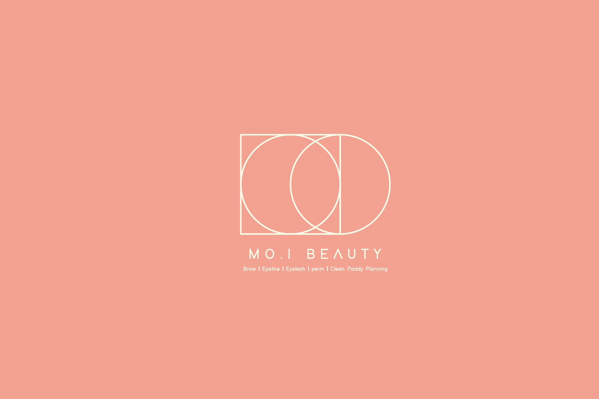
모아이뷰티는 정제된 기하학 구조를 기반으로 완성된 뷰티샵 아이덴티티 디자인 프로젝트입니다. 원과 사각형의 균형 있는 조합으로 구성된 심볼은 브랜드 이니셜을 추상적으로 표현하면서도, 뷰티 브랜드 특유의 섬세함과 안정감을 동시에 전달합니다.
미니멀한 라인 중심의 심볼 디자인은 과한 장식 없이도 세련된 이미지를 만들어내며, 고급스러운 컬러 톤과 함께 뷰티샵의 전문성과 감각적인 무드를 강조합니다. 로고 타입과 심볼이 독립적으로도 활용 가능하도록 설계되어 간판, 명함, 패키지, SNS 등 다양한 매체에서 일관된 브랜드 경험을 제공합니다.
속눈썹, 반영구, 눈썹 디자인 등 퍼스널 뷰티 서비스를 중심으로 한 샵 브랜딩에 적합한 아이덴티티 구조로, 뷰티샵 창업 및 리브랜딩을 고려하는 브랜드에 참고가 될 수 있는 디자인 사례입니다.
MOI Beauty is a beauty salon identity design built on a refined geometric foundation. The symbol combines circles and rectangles in a balanced composition, abstractly representing the brand initials while conveying both delicacy and stability — key qualities in modern beauty branding.
The minimalist line-based mark delivers a sophisticated visual presence without relying on heavy ornamentation. Paired with a soft, premium color tone, the identity emphasizes professionalism while maintaining an elegant and contemporary mood. The logo system was designed for flexible use across signage, business cards, packaging, and social media, ensuring consistent brand recognition.
With its clean and versatile structure, this identity is well suited for beauty startups and rebranding projects, especially for salons specializing in lashes, brows, and semi-permanent beauty services.