
구미 카페 브랜딩 로고 디자인 - 모어커피 아이덴티티
날짜: 2022.05.
작업: 아이덴티티 디자인
의뢰: 모어커피
디렉터: 권보배
디자인: 권보배
Date: 2022.05.
Type: Identity design
Client: More Coffee
Director: BOBAE KWON
Design: BOBAE KWON
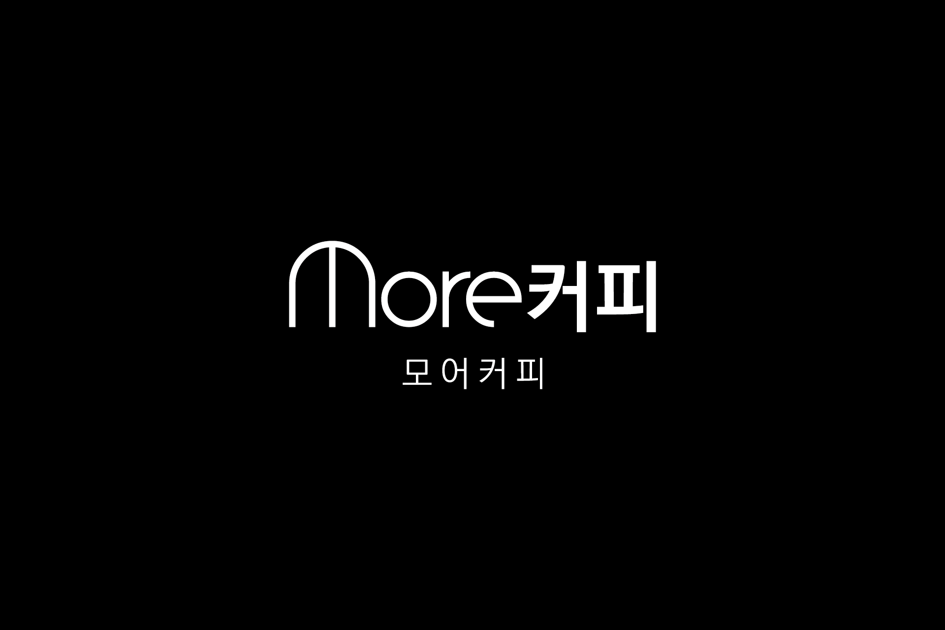
모어커피 브랜드 아이덴티티 디자인 프로젝트입니다. 구미 지역 카페 브랜딩을 위해 로고 디자인부터 브랜드 톤앤매너까지 전반적인 아이덴티티를 구축했습니다.
로고는 간결한 구조 안에서 브랜드의 인지성을 높이는 방향으로 설계되었으며, 심볼과 타이포가 함께 작동하는 형태로 다양한 매체에 유연하게 적용될 수 있도록 디자인되었습니다. 단순한 로고 제작을 넘어, 향후 간판, 사인물, 패키지 등 공간과 인쇄물 전반으로 확장 가능한 브랜딩 기반을 고려해 개발된 사례입니다.
브랜드명이 직관적으로 읽히면서도 시각적인 리듬감을 갖도록 조형 균형을 다듬었으며, 카페 특유의 편안한 무드를 유지하면서도 또렷한 인상을 남길 수 있도록 미니멀한 방향으로 완성했습니다. 로컬 브랜드가 지속적으로 확장 가능한 아이덴티티 구조를 만드는 데 초점을 맞춘 프로젝트입니다.
This project focuses on the brand identity design for More Coffee. Developed for a local café in Gumi, the project covers the overall branding foundation from logo design to visual tone and consistency.
The logo was designed with a minimal yet recognizable structure, allowing both symbol and typography to function harmoniously across various applications. Rather than a standalone logo, the identity was built with scalability in mind, enabling seamless expansion into signage, spatial graphics, and printed materials.
The typographic balance was refined to create a clear reading flow while maintaining visual rhythm. The final identity delivers a clean and modern impression while preserving the warm and approachable character of a café brand. The project emphasizes building a sustainable brand system for long-term growth.