
구미 중식당 로고 디자인 - 구룡 중화요리 브랜딩 사례
날짜: 2023.03.
작업: 아이덴티티 디자인
의뢰: 구룡중화요리
디렉터: 권보배
디자인: 권보배
Date: 2023.03.
Type: Identity design
Client: GURYONG restaurant
Director: BOBAE KWON
Design: BOBAE KWON
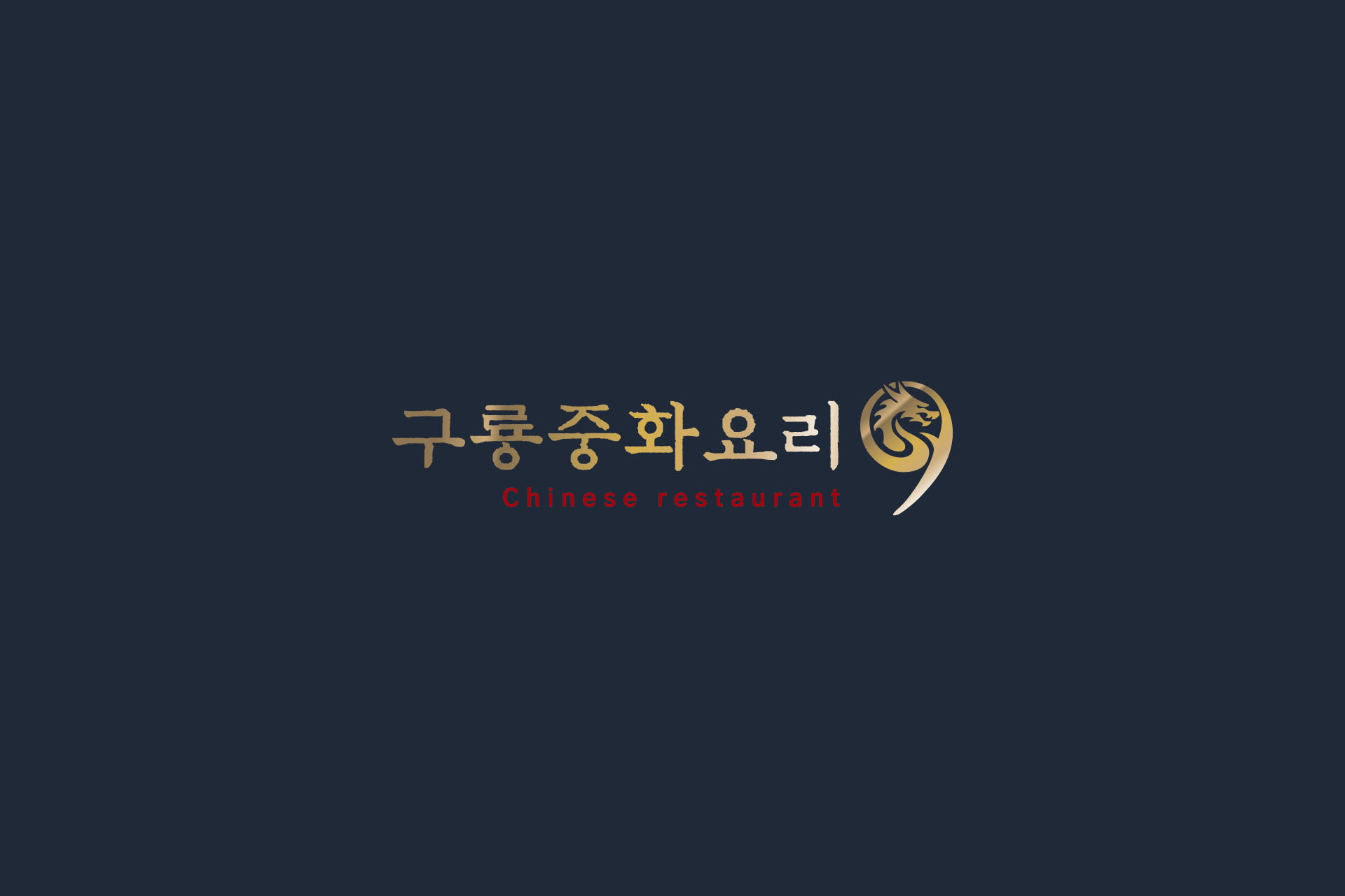
구룡 중화요리 브랜딩은 전통 중식당의 무게감과 고급스러운 이미지를 현대적으로 풀어낸 로고 디자인 프로젝트입니다. 브랜드명 ‘구룡’의 상징성을 살리기 위해 동양적 상징인 용을 중심 모티프로 설정하고, 한자 서체 기반의 로고타입과 결합해 클래식한 분위기를 강조했습니다.
금색 계열 심볼과 다크 네이비 배경 조합은 중식당 특유의 깊이감과 품격을 시각적으로 표현하며, 간판 및 실내 사인물에서도 높은 존재감을 유지할 수 있도록 설계되었습니다. 붓글씨 질감을 살린 타이포그래피는 전통 중화요리의 정통성을 전달하면서도 브랜드의 신뢰감을 강화합니다.
로고는 간판, 메뉴판, 유니폼 등 다양한 매체 적용을 고려해 제작되었으며, 전통성과 상업성을 균형 있게 담아낸 중식당 브랜딩 사례입니다.
The Guryong Chinese Restaurant branding project focuses on translating the elegance and authority of traditional Chinese cuisine into a refined visual identity.
The brand name “Guryong,” meaning nine dragons, inspired the core motif of a stylized dragon emblem. This symbol is paired with calligraphy-inspired typography to create a logo that feels both traditional and timeless.
A gold-on-deep-navy color scheme reinforces a sense of prestige and depth, making the identity highly visible across signage and interior applications. The brush-style lettering adds an authentic cultural nuance while enhancing brand credibility.
Designed for versatility across storefront signage, menus, and uniforms, the identity balances heritage and modern commercial appeal, presenting a strong example of contemporary Chinese restaurant branding.