
구미 두부 전문점 로고 디자인 - 오늘두부 브랜딩 사례
날짜: 2022.12.
작업: 아이덴티티 디자인
의뢰: 오늘두부
디렉터: 권보배
디자인: 권보배
Date: 2022.12.
Type: Identity design
Client: Oneul Dubu
Director: BOBAE KWON
Design: BOBAE KWON
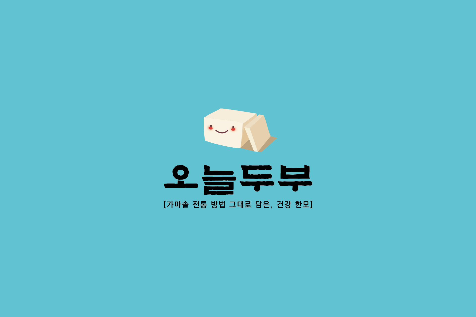
오늘두부 브랜딩은 전통 수제두부의 정직한 이미지를 친근한 캐릭터형 아이덴티티로 풀어낸 로고 디자인 프로젝트입니다. 가마솥 방식으로 만드는 수제두부의 따뜻한 제조 과정을 시각적으로 전달하기 위해, 두부를 모티프로 한 단순한 형태의 캐릭터 심볼을 중심으로 브랜드를 구성했습니다.
부드러운 질감을 연상시키는 라운드 형태와 미소를 띤 표정은 전통 식품이 주는 건강함과 편안함을 동시에 전달합니다. 민트 계열 배경 컬러를 활용해 기존 전통 식품 브랜드와 차별화된 젊은 이미지를 부여하면서도, 자연스럽고 깨끗한 브랜드 인상을 유지하도록 설계했습니다.
로고는 간판, 패키지, 스티커 등 소형 매체에서도 명확하게 인식될 수 있도록 단순한 구조로 개발되었으며, 지역 기반 식품 브랜드에 어울리는 따뜻한 정서를 시각적으로 담아낸 브랜딩 사례입니다.
The Oneul Dubu branding project focuses on translating the warmth and honesty of handmade tofu into a friendly, character-based identity.
Inspired by traditional cauldron-style tofu making, the logo features a simplified tofu-shaped mascot designed to communicate softness and approachability. The rounded geometry and gentle expression reflect the comfort and trust associated with traditional Korean foods.
A fresh mint-toned background differentiates the brand from conventional rustic food visuals, introducing a clean and modern feel while maintaining a natural and wholesome impression.
Designed for practical applications such as signage, packaging, and labels, the identity maintains strong recognizability even at small scales. This project demonstrates how traditional food branding can be reinterpreted with a contemporary and approachable visual language.