
리켐 화학·소재 기업 브랜드 아이덴티티 디자인 사례
날짜: 2016. 12.
작업: 아이덴티티 디자인, 브랜딩
의뢰: 리켐
디렉터: 권보배
디자인: 권보배
Date: 2016. 12.
Type: Brand Identity Design
Client: Richem
Director: BOBAE KWON
Design: BOBAE KWON
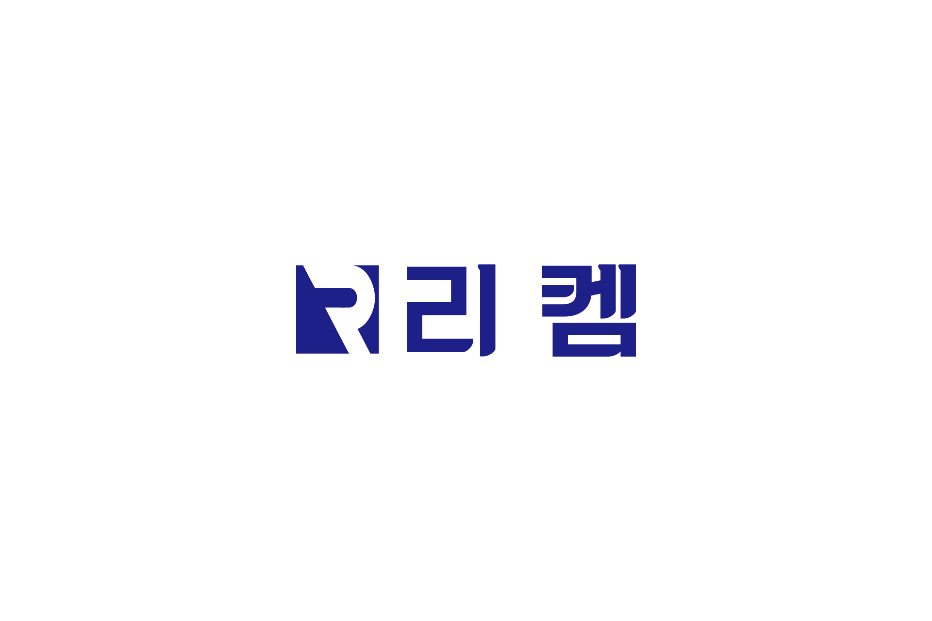
리켐은 화학 및 소재 산업 기반 기업으로, 전문성과 신뢰성을 중심으로 한 브랜드 아이덴티티가 요구되었습니다.
브랜드 디자인은 산업 기업에 적합한 구조적 안정감과 기술적 이미지를 강조하는 방향으로 개발되었습니다. 심볼은 이니셜 R을 모티브로 구성하여 기업 정체성을 명확히 전달하고, 직선적이고 간결한 타이포그래피를 적용해 기술 기반 기업의 신뢰감을 강화했습니다. 딥 블루 컬러는 안정성과 전문성을 상징하며, B2B 산업 환경에서의 브랜드 신뢰도를 높이도록 설계되었습니다.
해당 아이덴티티는 기업 홍보 브로슈어, 전시회 부스 디자인, 제품 카탈로그, 기술 제안서, 온라인 마케팅 등 다양한 산업 커뮤니케이션 환경에서 활용될 수 있도록 구축되었습니다. 산업·화학·소재 기업의 장기적 브랜드 자산 형성을 고려한 기업 아이덴티티 디자인 사례입니다.
Richem is a chemical and materials-based company that required a brand identity centered on professionalism and reliability.
The identity was developed with a focus on structural clarity and technical precision appropriate for industrial enterprises. The symbol is derived from the initial “R,” reinforcing corporate recognition, while clean and geometric typography strengthens the image of technological expertise. A deep blue color palette was selected to communicate stability and trust—key attributes in B2B industrial markets.
The identity system was designed for scalable application across corporate brochures, trade show booths, product catalogs, technical proposals, and digital marketing platforms. This project represents a strategic branding approach tailored for long-term asset building within chemical and industrial sectors.