
삼상식당 김천 가정식 브랜드 아이덴티티 디자인 사례
날짜: 2020. 02.
작업: 아이덴티티 디자인, 브랜딩
의뢰: 삼상식당
디렉터: 권보배
디자인: 권보배
Date: 2020. 02.
Type: Brand Identity Design
Client: Samsang Restaurant
Director: BOBAE KWON
Design: BOBAE KWON
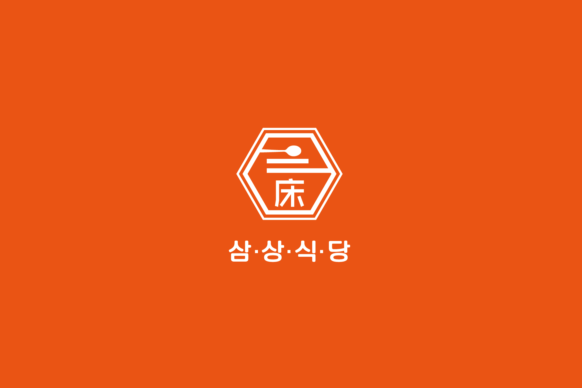
삼상식당 아이덴티티 디자인은 김천 지역에서 운영되는 가정식 전문 식당의 브랜드 이미지를 구축하기 위한 프로젝트입니다. 육각형 프레임 안에 숟가락과 한자 요소를 결합하여 전통적인 한식의 정체성과 정갈한 집밥 이미지를 상징적으로 표현했습니다.
강렬한 오렌지 컬러는 따뜻한 가정식의 온기와 활기를 전달하며, 간결한 구조의 심볼은 간판, 메뉴판, 포장 용기, 홍보물 등 다양한 매체에서 일관성 있게 적용될 수 있도록 설계되었습니다. 지역 상권 내에서 시각적 인지도를 높이고, 김천 가정식 식당이라는 포지셔닝을 명확히 전달하는 브랜딩 전략을 반영한 사례입니다.
김천 지역 고객에게 친근하면서도 신뢰감을 주는 외식업 아이덴티티 디자인 프로젝트입니다.
The Samsang Restaurant brand identity was developed for a home-style Korean restaurant located in Gimcheon. The hexagonal frame combined with a spoon symbol and traditional Chinese character elements represents authentic Korean cuisine and the warmth of homemade meals.
The vibrant orange color conveys energy and hospitality, while the clean and structured symbol allows consistent application across signage, menus, packaging, and promotional materials. The identity was designed to strengthen local brand recognition within the Gimcheon commercial district and clearly position the restaurant as a trusted home-style dining space.
This project reflects a strategic branding approach tailored for a regional Korean restaurant market.