
구미 레스토랑 로고 디자인 - 슬로라구 이탈리안 레스토랑 브랜딩
날짜: 2022.07.
작업: 아이덴티티 디자인
의뢰: 슬로라구
디렉터: 권보배
디자인: 권보배
Date: 2022.07.
Type: Identity design
Client: Slow Ragu
Director: BOBAE KWON
Design: BOBAE KWON
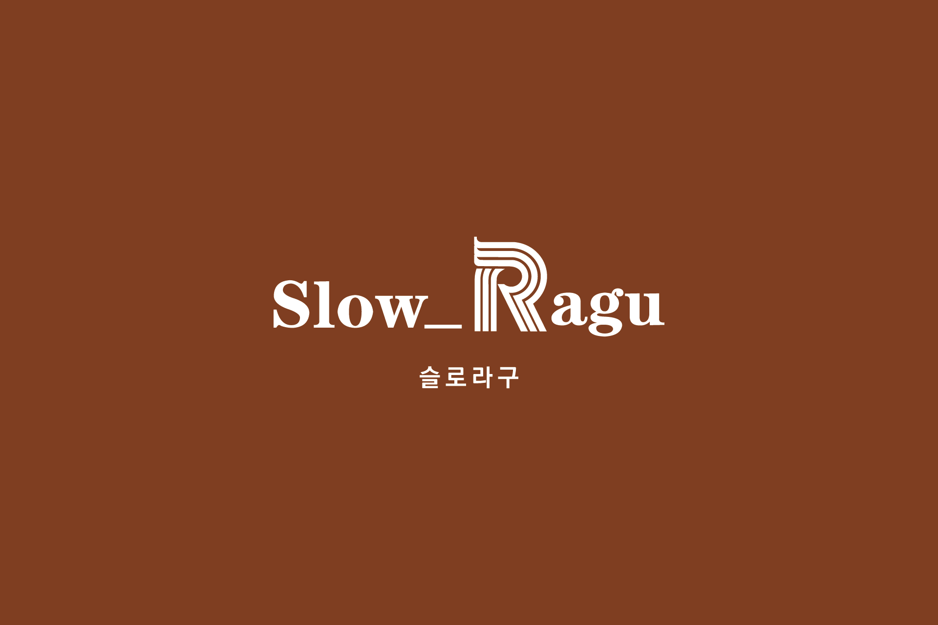
슬로라구는 정통 이탈리안 요리의 깊은 풍미를 브랜드 아이덴티티로 풀어낸 레스토랑 브랜딩 프로젝트입니다. 브랜드명에서 전달되는 ‘슬로우 푸드’의 가치와 클래식한 레스토랑 이미지를 중심으로, 절제된 타이포그래피 기반의 로고를 개발했습니다.
로고는 세리프 서체를 바탕으로 구성하여 고급스럽고 안정적인 인상을 전달하며, 라구의 깊은 풍미와 시간을 들여 완성되는 요리의 정체성을 시각적으로 표현했습니다. 이니셜 R을 활용한 심볼 구조는 브랜드의 기억도를 높이면서도 간결한 조형미를 유지하도록 설계되었습니다.
간판, 메뉴판, 패키지 등 다양한 매체에 적용 가능한 구조로 설계되어 실제 매장 환경에서도 일관된 브랜드 경험을 제공합니다. 과하지 않은 그래픽 언어를 통해 레스토랑 특유의 여유롭고 따뜻한 분위기를 담아낸 브랜딩 사례입니다.
This project presents the brand identity design for Slow Ragu, an Italian restaurant inspired by the philosophy of slow food and traditional cooking.
The logo is built around a classic serif typography that conveys elegance and depth, reflecting the time-intensive nature of ragu-based cuisine. The stylized “R” symbol serves as a memorable visual anchor while maintaining a refined and minimal aesthetic.
Designed for versatile application across signage, menus, and packaging, the identity delivers a cohesive brand experience in real dining environments. The restrained visual language captures the warm and relaxed atmosphere of an Italian restaurant while maintaining a timeless brand presence.