
에스앤팜 의약품 유통기업 브랜드 아이덴티티 디자인 사례
날짜: 2017
작업: 아이덴티티 디자인, 브랜딩
의뢰: 에스앤팜
디렉터: 권보배
디자인: 권보배
Date: 2017
Type: Brand Identity Design
Client: SN Pharm
Director: BOBAE KWON
Design: BOBAE KWON
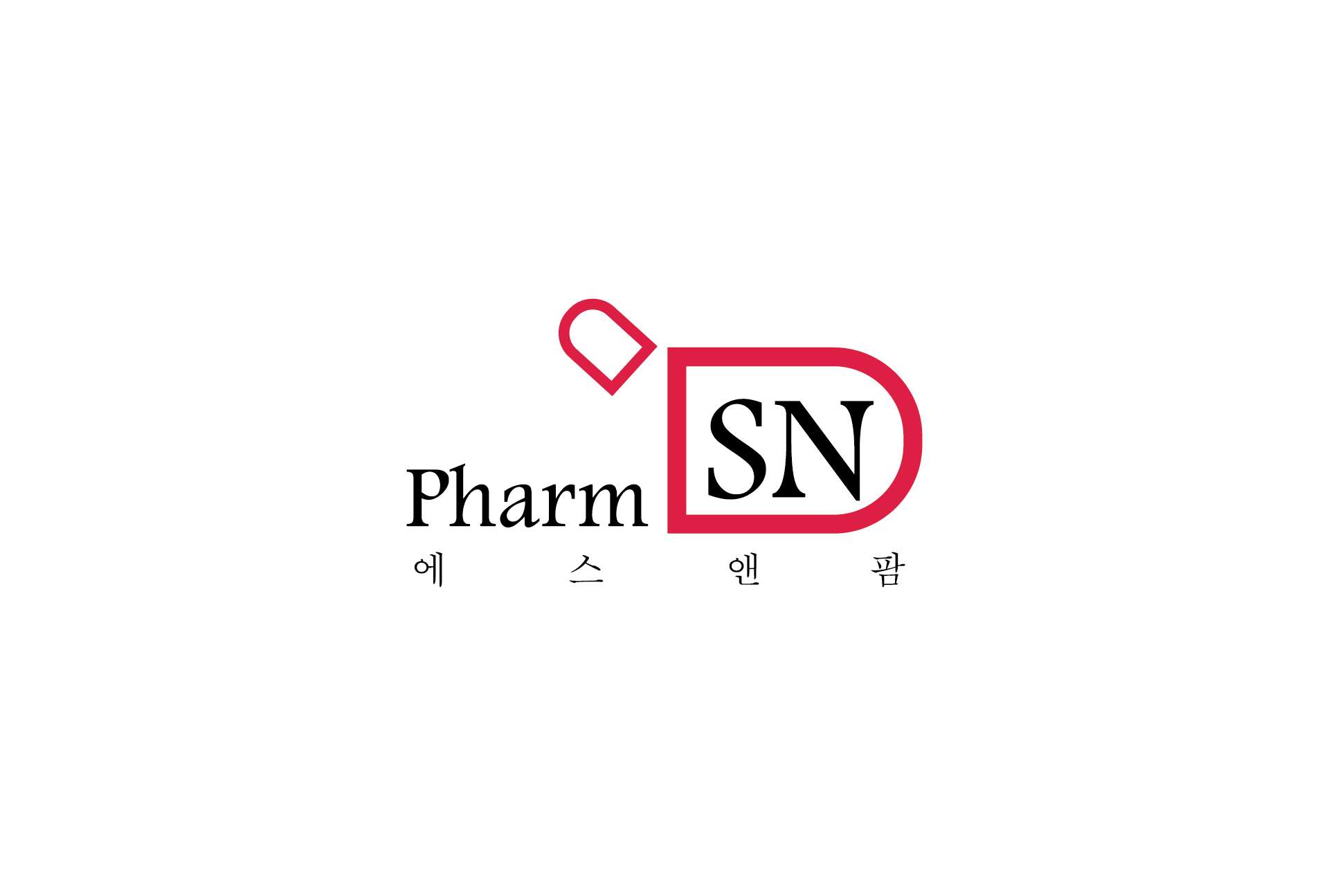
에스앤팜(SN Pharm)은 의약품 유통 및 도매를 전문으로 하는 기업으로, 의료 산업 특성상 신뢰와 안정성이 브랜드 핵심 가치로 설정되었습니다. 아이덴티티 디자인은 기업의 전문성과 파트너십 이미지를 명확히 전달하는 방향으로 기획되었습니다.
로고는 ‘SN’을 중심으로 구성하여 기업명을 직관적으로 인지할 수 있도록 설계했으며, 심볼 외곽의 형태는 보호와 안정, 관리 체계를 상징합니다. 레드 컬러는 책임감과 신속한 유통 시스템을 표현하고, 블랙 타이포그래피는 기업의 전문성과 신뢰도를 강조합니다.
해당 브랜드 아이덴티티는 회사소개서, 납품 제안서, 기업 홍보물, 명함, 차량 래핑, 온라인 기업 홍보 등 다양한 B2B 마케팅 환경에서 일관되게 활용될 수 있도록 설계되었습니다. 의료·제약 산업군에서 요구되는 공공성과 신뢰 기반 브랜딩을 구축한 사례입니다.
SN Pharm is a pharmaceutical wholesale and distribution company where trust and reliability are core brand values. The identity design was developed to clearly communicate corporate professionalism and strong partnership credibility within the healthcare industry.
The logo centers around the initials “SN” to ensure clear brand recognition, while the enclosing symbol shape represents protection, stability, and systematic management. The red accent conveys responsibility and efficient distribution capability, while the black typography reinforces corporate authority and trust.
This brand identity system was designed for consistent application across company profiles, supply proposals, corporate brochures, business cards, vehicle graphics, and digital marketing materials. It demonstrates a strategic branding approach tailored to the credibility-driven pharmaceutical and healthcare distribution sector.