
스터커피 카페 브랜드 아이덴티티 디자인 사례
날짜: 2020. 11.
작업: 아이덴티티 디자인, 브랜딩
의뢰: 스터커피
디렉터: 권보배
디자인: 권보배
Date: 2020. 11.
Type: Brand Identity Design
Client: STIR COFFEE
Director: BOBAE KWON
Design: BOBAE KWON
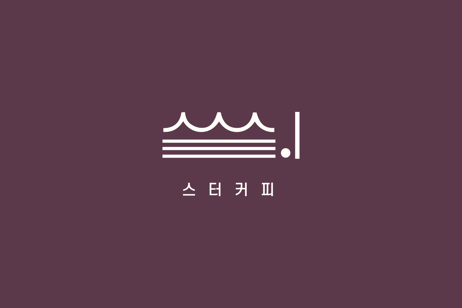
스터커피는 브랜드명 ‘스’와 ‘터’의 한글 구조를 해체하고 재조합해 하나의 심볼로 재탄생시킨 카페 아이덴티티 디자인 프로젝트입니다. 단순히 텍스트를 배치하는 방식이 아니라, 각 음절의 형태적 특징을 추출해 그래픽 요소로 재구성함으로써 브랜드만의 시각 언어를 구축했습니다.
상단의 곡선 요소는 ‘스’의 형태를 변형해 부드러운 리듬감을 형성하고, 하단의 수평 라인은 ‘터’의 구조를 정제된 선형 요소로 단순화해 안정감을 부여합니다. 점과 수직선은 마침표처럼 브랜드의 존재감을 강조하는 장치로 작동합니다.
절제된 컬러와 미니멀한 구성은 카페 공간, 간판, 패키지, 굿즈 등 다양한 접점에서 확장 가능한 시스템을 고려해 설계되었습니다. 한글 타이포그래피를 기반으로 한 감각적인 카페 브랜딩 사례로, 창업 브랜드 및 리뉴얼 프로젝트에 적용 가능한 구조적 디자인 접근을 보여줍니다.
Stir Coffee is a café brand identity project built by deconstructing and reconstructing the Korean syllables “스” and “터” into a unified symbol. Rather than simply arranging text, the design extracts structural characteristics of each syllable and transforms them into a distinctive visual system.
The curved upper elements reinterpret the form of “스,” creating a soft rhythmic impression, while the horizontal lines simplify the structure of “터” into refined linear components that convey stability. A dot and vertical stroke function as a visual punctuation mark, reinforcing brand presence.
The restrained color palette and minimal composition were developed with scalability in mind, ensuring cohesive application across signage, packaging, spatial graphics, and merchandise. This project demonstrates a structural approach to café branding based on Korean typography, suitable for both new startups and brand renewal strategies.