
TG건설 주식회사 기업 아이덴티티(CI) 디자인
날짜: 2020. 04.
작업: 아이덴티티 디자인, 브랜딩
의뢰: 티지건설
디렉터: 권보배
디자인: 권보배
Date: 2020. 04.
Type: Brand Identity Design
Client: TG건설
Director: BOBAE KWON
Design: BOBAE KWON
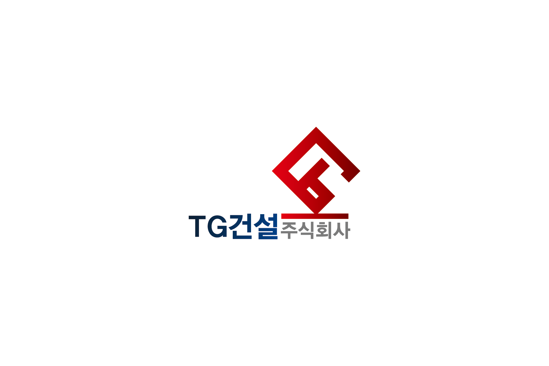
TG건설 아이덴티티 디자인은 건설회사의 신뢰성과 구조적 안정성을 시각적으로 구현한 기업 CI 개발 프로젝트입니다. 심볼은 T와 G 알파벳을 기하학적으로 재구성하여 하나의 구조체처럼 보이도록 설계하였으며, 건축 구조물의 결합과 균형을 상징합니다.
레드 컬러는 추진력과 실행력을, 블루 톤의 로고타입은 기업의 안정성과 전문성을 표현합니다. 단순한 형태 안에서도 건설사의 조직력과 견고함이 드러나도록 비례와 각도를 정밀하게 조율했습니다.
로고는 현장 안전 표지, 차량 래핑, 현장 가림막, 명함, 제안서, 관급 프로젝트 문서 등 다양한 적용 환경을 고려하여 확장성을 중심으로 설계되었습니다.
건설사·시공사·종합건설 법인을 위한 기업 아이덴티티 구축 사례입니다.
건설사·시공사·종합건설 법인을 위한 기업 아이덴티티 구축 사례입니다.
The TG Construction corporate identity was developed to visually express structural stability and corporate credibility within the construction industry. The symbol is a geometric reconstruction of the letters “T” and “G,” forming a unified structural mark that reflects architectural balance and strength.
The red accent represents execution power and momentum, while the deep blue logotype conveys professionalism and reliability. Proportions and angles were carefully refined to embody solidity and precision.
The identity system was designed for practical application across construction site signage, vehicle graphics, safety boards, proposals, and official documentation.
This project demonstrates a strategic CI development approach tailored for construction companies and general contractors.
This project demonstrates a strategic CI development approach tailored for construction companies and general contractors.