
최상위학원 수학전문 교육 브랜드 아이덴티티 디자인 사례
날짜: 2020. 02.
작업: 아이덴티티 디자인, 브랜딩
의뢰: 삼상식당
디렉터: 권보배
디자인: 권보배
Date: 2020. 02.
Type: Brand Identity Design
Client: Samsang Restaurant
Director: BOBAE KWON
Design: BOBAE KWON
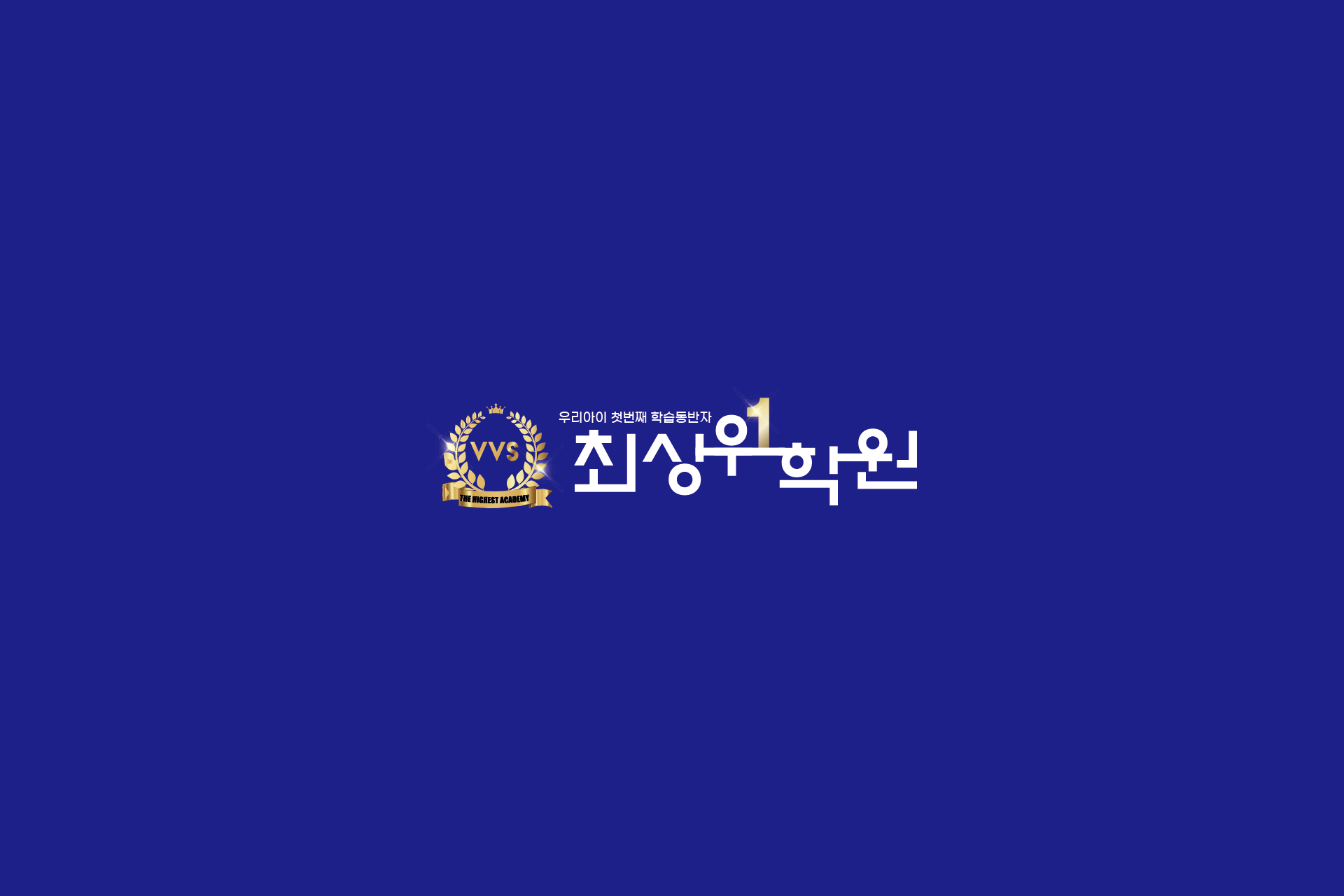
최상위학원 아이덴티티 디자인은 수학전문 교육기관의 신뢰성과 상위권 이미지를 시각적으로 구현한 브랜딩 프로젝트입니다. 왕관과 월계수 심볼을 활용하여 성취, 1등, 최상위라는 상징적 메시지를 명확하게 전달하도록 설계되었습니다.
딥 블루 컬러는 전문성과 안정감을 표현하며, 골드 포인트 요소는 프리미엄 교육 브랜드의 위상을 강조합니다. 로고는 간판, 학원 내부 사인물, 교재 표지, 온라인 홍보물 등 다양한 매체에서 일관되게 적용될 수 있도록 구조화되었습니다.
경쟁이 치열한 학원 시장에서 학부모와 학생 모두에게 신뢰를 전달할 수 있는 수학학원 브랜드 아이덴티티 디자인 사례입니다.
The Top Tier Academy brand identity was developed for a mathematics-focused educational institute. The crown and laurel wreath symbols visually communicate achievement, excellence, and top-ranking performance.
The deep blue color reflects professionalism and trust, while gold accents reinforce a premium academic positioning. The logo system was structured for consistent application across signage, textbooks, promotional materials, and digital platforms.
This project demonstrates a strategic education branding approach designed to build credibility and recognition in a competitive private academy market.