
육단 한우한돈 축산물 직판장 아이덴티티 디자인
날짜: 2021. 01.
작업: 아이덴티티 디자인, 브랜딩
의뢰: 육단
디렉터: 권보배
디자인: 권보배
Date: 2021. 01.
Type: Brand Identity Design
Client: YUKDAN
Director: BOBAE KWON
Design: BOBAE KWON
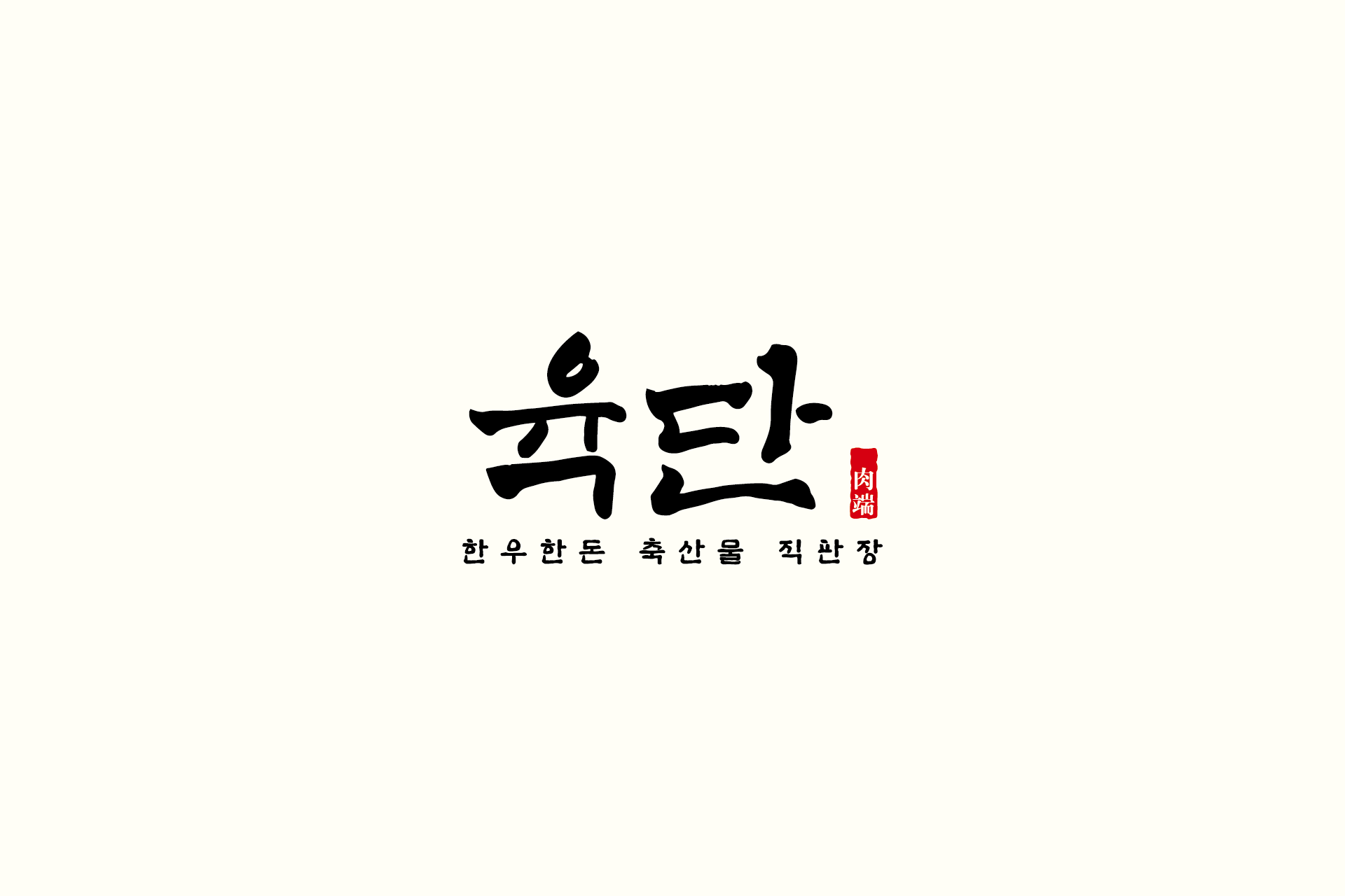
육단은 한우·한돈 축산물 직판장의 신뢰도를 시각적으로 전달하기 위해 설계된 정육 브랜드 아이덴티티 디자인 프로젝트입니다. 강한 필획의 서체 중심 로고는 정직한 품질과 직판장의 무게감을 담아내기 위해 전통적인 붓글씨 스타일로 개발되었습니다.
로고 하단의 한우·한돈 축산물 직판장 문구는 브랜드의 정체성을 명확하게 전달하며, 소비자가 한눈에 업종을 인지할 수 있도록 정보 전달력을 강화했습니다. 우측의 붉은 낙관 형태 요소는 정통성과 장인 이미지를 강조하며, 축산 브랜드 특유의 신뢰감을 보완하는 역할을 합니다.
간판, 정육 패키지, 포장지, 매장 사인, 온라인 홍보물 등 다양한 적용 환경에서도 안정적인 가독성과 브랜드 존재감을 유지하도록 설계된 아이덴티티입니다. 정육점 창업, 한우 직판장 브랜딩, 축산물 브랜드 리뉴얼을 고민하는 업종에 적합한 실전형 디자인 사례입니다.
Yukdan is a butcher shop and meat direct-sales brand identity project designed to visually communicate trust and authenticity. The bold brush-style logotype was developed to reflect the weight and credibility of a premium Hanwoo and pork retailer.
The descriptor highlighting Hanwoo and pork direct sales clearly defines the brand category, ensuring instant recognition of the business type. The red seal-inspired stamp element reinforces tradition and craftsmanship, adding a layer of authenticity often associated with heritage food brands.
The identity was designed for versatile applications across storefront signage, packaging, labels, and promotional materials, maintaining clarity and brand presence in both physical and digital environments. This project serves as a practical branding reference for butcher shop startups, premium meat retailers, and livestock brand positioning.